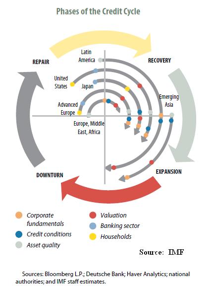
Another great chart from the IMF.
 (click here if chart is not observable)
This site uses Akismet to reduce spam. Learn how your comment data is processed.
In economics, things take longer to happen than you think they will, and then they happen faster than you thought they could.
Email subscribers should always click the website version as many times the original post is edited and updated. Thank you.

Pingback: Phases of the Credit Cycle | FMTrading Blog
Superb chart. Can you explain the difference between Valuation and Asset Quality? Seems they are very related.
Emerging Asia starved for credit, plenty available in the US and EUR but no takers.
And look at where the Japanese banks are after 20 years, shocking. US and EUR should learn the lesson and stop propping the zombies.
Thanks! Go to page 29 in Chapter 1 of the IMF’s GFSR.
Click to access ch1.pdf
I have been looking for an updated version of this in the latest IMF GFSR But it doesn’t seem to be there. Is there one?????
Updated chart for 2019?