The punk employment data makes us think the economy is running out of labor. Very similar to the dynamics in the housing market.
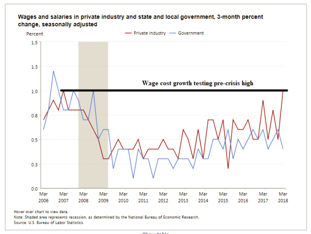
The markets are lathered up about the annual moderate average hourly earnings growth of 2.6 percent. The better measure is the wage component of the Employment Cost Index (ECI), which is growing close to 4 percent on annualized basis, approaching pre-crisis highs.
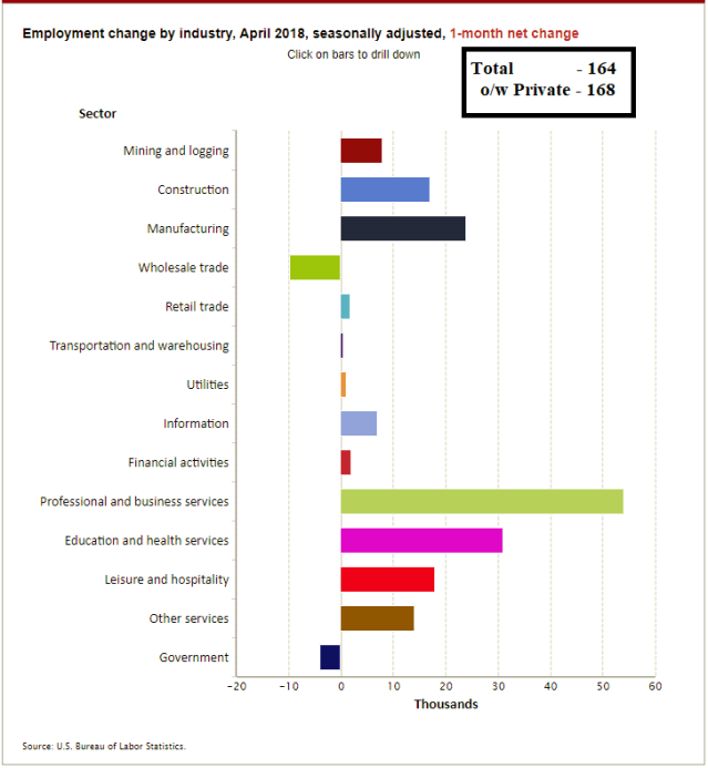
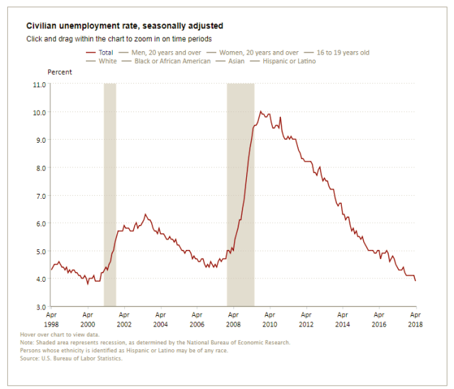
Total nonfarm payroll employment increased by 164,000 in April, and the unemployment rate edged down to 3.9 percent, the U.S. Bureau of Labor Statistics reported today. Job gains occurred in professional and business services, manufacturing, health care, and mining.
…The average workweek for all employees on private nonfarm payrolls was unchanged at 34.5 hours in April. In manufacturing, the workweek increased by 0.2 hour to 41.1 hours, while overtime edged up by 0.1 hour to 3.7 hours. The average workweek for production and nonsupervisory employees on private nonfarm payrolls increased by 0.1 hour to 33.8 hours. (See tables B-2 and B-7.)
In April, average hourly earnings for all employees on private nonfarm payrolls rose by 4 cents to $26.84. Over the year, average hourly earnings have increased by 67 cents, or 2.6 percent. Average hourly earnings of private-sector production and nonsupervisory employees increased by 5 cents to $22.51 in April. (See tables B-3 and B-8.) – BLS
Employment Change by Industry – 1-month net change
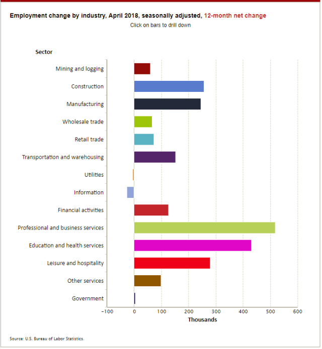
Employment Change by Industry – 12-month net change
Civilian Unemployment Rate
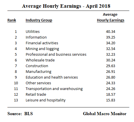
Employment and average hourly earnings by industry

Better Measure of Wage Inflation
We heavily discount the the average hourly earnings in the employment release for several reasons and believe the ECI is a better measure of wage pressures. Note the ECI wage index is running about 3.7 percent on annualized basis and is now back at pre-crisis highs.
The table average hourly wage from today’s employment report is indicative of our suspicions about wage data. The utility industry is the highest paic industry? Come on, man!
The economic signals in this data are, no doubt, being lost in aggregation and averaging. And who knows how much the BLS massages the data.
Hedonic Adjustments To Wages?
This raises an interesting question. If the BLS makes hedonic adjustments to consumer prices based on changes in quality, shouldn’t they adjust wages based on productivity?
Clayton Kershaw, for example, s the highest paid baseball player with an annual salary of $33 million. The quality of Kershaw’s performance has declined considerably in 2018. as he off to only a 1-4 win/loss record? Shouldn’t the BLS adjust down his salary?
We wonder if hedonic adjustments are made for tickets for sporting events if the home team tanks from first to last place for year-to-year?
Though an extreme example it illustrates why the quality of government data should be suspect, thought through, inspected and discounted to some extent.
Sorry to piss on the parade, folks.
Employment Cost Index (ECI) – wages and salaries