
President Trump and President Obama were in a big pissing match over the weekend on who should get credit for the current healthy economy.
Take our Rorschach Test by viewing the inkblots economic charts and you decide. Then take the quiz at the bottom of this post.
We present you the data over the past two administrations for the:
1) civilian unemployment rate
2) monthly change in jobs (nonfarm payrolls)
3) real y/y average hourly earnings growth
4) quarterly GDP growth
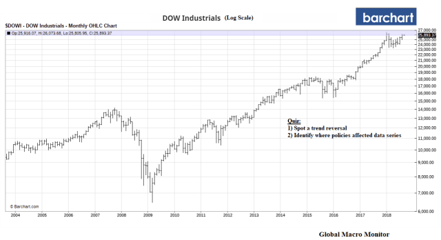
5) Dow Jones Industrials Average (log scale)
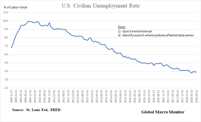
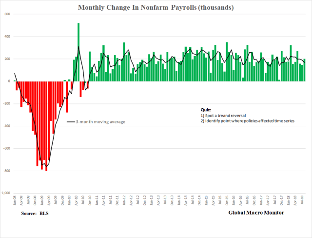
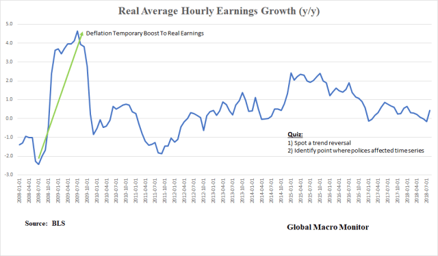
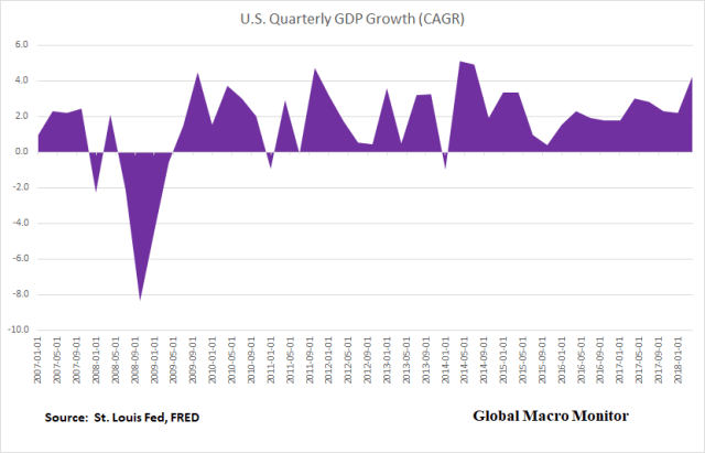
The Quiz
Please place your politics under the desk and out of sight lest they may distort your economic judgement.
For each chart:
- Spot a trend reversal in the data series;
- Identify where policies may have affected the economic or financial indicator in a large and meaningful manner. That is changed, or significantly affected the trend.
- Cover the date axis for each chart and try to identify when the new administration came to power based on your preconceived notion of the economic and financial data.
Bonus Questions:
- Which administration reversed an economic death spiral?
- Which administration was/has/is surfing the the economic and financial trend?
Answer:
Isn’t it obvious?

