
#CKStrong Never forgetting Carol K. We are with you, girl!
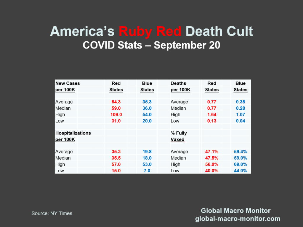
Anyone see a pattern here?
If you stare at the chart long enough, you can see the pink red elephant [in the room].
Sadly this chart is largely a function of the state’s politics. Doesn’t have to be that way and people shouldn’t have to die for it.

America’s Death Cult And The Pro Life States
Never thought a large swath of America or a major political party would morph into a Jonestown death cult but it has. The data speaks for itself.
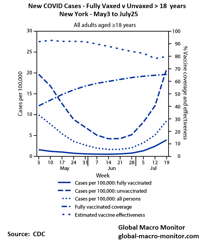


Wow. That line is well-fitted. What is R-squared?
It’s on the chart, King, .4949. Not bad for a non-times series.
If it were not for North Dakota, this curve would be even worse!
>
Right, Larry. Added some new data.
Dear vaxxed dummies, look at your source…