
We have crunched a lot of data from Friday’s nonfarm payrolls report (NFP) and have made some fascinating observations to share with our readers.
This is the first post in a series in which we go deep into the data to bring you our insights on the condition of the U.S. labor market. The later posts will get more granular into the employment subsectors (see last table below)
#1 – Total Private Nonfarm Payrolls
We prefer the private sector data, which excludes 22 million government jobs, of which 64 percent are local government payrolls; state governments make up 23 percent. The federal government (x/ military) is 13 percent of total government payrolls.
Government workers are, in general, shielded from market forces, and the Bureau of Labor Statistics (BLS) does not publish government wage data, at least not in the NFP report.

The above chart illustrates that private sector payrolls remain 7.4 million or 5.5 percent below their pre-COVID trend. Recall that from February 2020 to April 2020, the private sector lost 21 million jobs when the lights were turned off in most of the world’s economies as the COVID pandemic ravaged the globe.
Government payrolls lost 1 million jobs and didn’t bottom until December 2020, most of which were local government jobs.
Most Unrecovered NFPs Are In Three Sectors
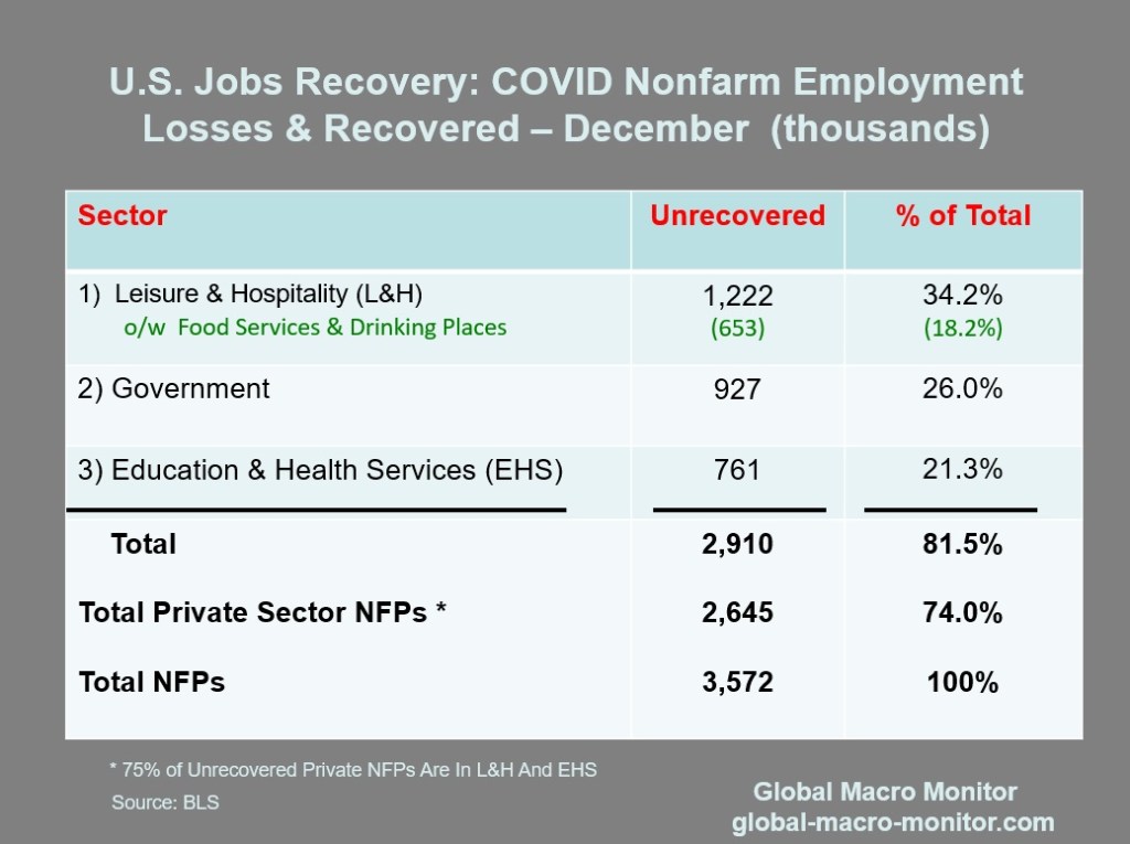
The above data show that 81.5 percent of all unrecovered NFPs are in three sectors: Leisure & Hospitality (L&H); Government (of which, 73 percent are local govenment jobs), and Education & Health Services (EHS).
The L&H and EHS sectors alone make up 75 percent of all private sector unrecovered NFPs.
Readers should make the distinction between the number of NFPs below trend and jobs lost during the initial labor market crash during 2020, which is the context of the data above.
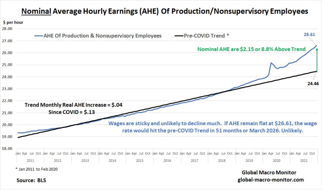
#2 – Nominal Average Hourly Earnings (AHE)
The chart below surely illustrates, at least to us, wage inflation, which make price increases sustainable, is undoubtedly not transitory. It appears wage growth is actually accelerating.
The December AHE is now $2.15 or 8.8 percent above its pre-COVID trend.
We asked in a post last August,
What is the Fed thinking?
… It’s clear the labor supply curve has shifted left.
Isn’t that evident with 32.2 percent of the unrecovered jobs in the leisure and hospitality sector, yet no workers can be found? Moreover, 62.2 percent of unrecovered jobs are in three sectors: leisure and hospitality, government, and education and healthcare. None for no lack for demand. – GMM, Aug 21
We warned that the Fed was repeating the same mistake of the mid-1970s, trying to monetize a supply shock with massive and ongoing stimulus.
We were also early in our inflation call in or Feburary 9th post, Ready For 4 Percent CPI By Mid-Year?
We also posted that it wouldn’t surprise us to see inflation print at 5 percent in 2021, and we were beaten down like red headed stepchild. I can say that because of my reddish hair..
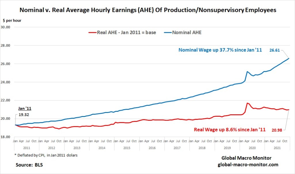
#3 Money Illusion
Money illusion is an economic theory positing that people have a tendency to view their wealth and income in nominal dollar terms rather than in real terms. In other words, it is assumed that people do not take into account the level of inflation in an economy, wrongly believing that a dollar is worth the same as it was the prior year. – Investopedia
We hear a lot of money illusion these days, with the noise and praise that wages are rising rapidly.
In some sectors, we are happy that wages are rising more than in others. However, rising wages without a corresponding increase in productivity is the gas that fuels inflation. This is evident in the following chart, which juxtaposes nominal against real AHE.
Notice that nominal AHE have been up 37.7 percent since January 2011 versus the 8.8 percent increase in real AHE.
We have deflated nominal AHE by the CPI index rebased to January 2011.
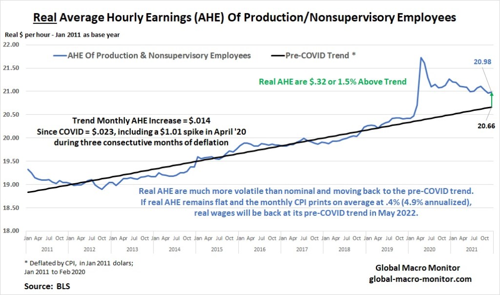
#4 Real Average Hourly Earnings
Our real AHE chart is very enlightening.
First, it illustrates how volatile real wages are compared to nominal.
Second, the real AHE is only $.32 or 1.5% above its pre-COVID trend.
Finally, if the CPI monthly prints come in at an average of 0.4 percent (4.9 percent annualized) and real AHE stays flat for production and nonsupervisory, the real macro wage will be back to trend by this May. Both components, nominal and CPI, won’t follow this trajectory, but we use the scenario for illustrious purposes to show how absurd money illusion is.
If the CPI print on Wednesday comes in hotter than the 0.6 percent increase in December’s AHE, the real macro wage will decline.
Upshot
Most, or 82 percent of the unrecovered NFPs are in three sectors: L&H, Government, and EHS.
Inflation hurts workers.
Money illusion is rampant.
Wages increases without a corresponding increase in productivity or the inability of producers to pass on rising input costs, which pressures profit margins, is inflationary.
The following table is an appetizer of our next post, which we hope will be published tomorrow depending on doctors’ orders.
Notice a pattern, anyone?
Stay frosty, folks.


