

We have looked at the central bank holdings — both the Fed and foreign central banks — of marketable Treasury bills, notes, and bonds over the past twenty years and were quite surprised by our findings. Our analysis may also help explain the mess now taking place in the money markets, which is taking massive Fed intervention to stabilize.
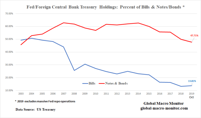
The above table of data illustrates the Fed and foreign central banks held almost 50 percent of the Treasury bills outstanding up until the Great Financial Crisis (GFC) and now hold only 13.81 percent of marketable bills as of October 2019. Note the October data does not include Fed repo but only bills held outright in its SOMA portfolio and financed by an increase in reserves.
It also was surprising that even with the massive expansion of the Fed’s balance sheet during the QEs, their ownership of the outstanding marketable notes and bonds only increased from around 15 percent to 22 percent. It does make sense considering there was a corresponding massive increase in Treasury debt issuance during the past ten years.

Our September 2018 Post
We wrote a huge post on the structural changes taking place in the Treasury market in September 2018, The Gathering Storm In The Treasury Market 2.0, warning there would be huge natural upward pressure on interest rates given these changes and/or the markets would come under pressure from the increased market supply risking “crowding out” of other markets.
Soon thereafter, the 10-year Treasury yield broke out crashing the stock market with the S&P falling 20 percent in just a little over two months. We underestimated Judy how fragile markets to a only modest rise in long-term interest rates.
In no way was the Fed “too tight” in a monetary and credit sense in Q4 2018, in our opinion, with real interest rates still close to, or below zero and credit still abundantly available. The market just couldn’t handle the massive new supply of debt caused by the combination of a growing budget deficit and the Treasury having to refinance the maturities coming due in the Fed’s SOMA portfolio.
Consequently, the stock market crashed bringing in haven flows and short-sellers using Treasuries as proxy stock shorts driving rates lower and the Fed eventually capitulating to the market and political pressure.
Marketable Debt Growing Faster Than Total Debt
One of the structural changes we flagged was that the Treasury could no longer rely on the Social Security surplus to fund itself as it now has moved into an annual structural deficit. The added Treasury supply would put significant pressure on the market. The debt table above illustrates how the Treasury is becoming increasingly reliant on market financing for its growing obligations.
The data show that even though the total public debt has grown 228.79 percent since 2003, debt issuance to the markets has increased at a 50 percent faster clip, increasing by 361.91 percent, compared to the punk 83.72 percent growth in nominal GDP.
It is absolutely clear, at least to us, especially given that interest rates cannot increase to their equilibrium and market-clearing levels without crashing the markets (think Q4 2018) due to the sheer size of the total stock of debt outstanding, market disequilibria will always show up in unexpected places, such as in the cash markets.
The Fed, not only the lender of the last resort, is now called upon to plug the financing gap so the markets won’t blow up. In a non-reserve currency, this would be very inflationary and it takes us back to our days as an economist following the high inflation economies of Latin America.
Banking System
Much has been written about the lack of reserves in the banking system, which is not allowing for a natural arbitrage between the Fed funds and repo market. Our priors were there was a distribution problem with excess reserves, where a few banks owned most of the reserves, which now appears to have been confirmed. Nevertheless, we are not experts in this area and will leave it to others to explain.
Structural Fix In Money Markets?
To get back to a level where central banks hold 44 percent of the T-Bill stock as they did before the GFC, the Fed would have to take down another $750 billion of T-Bills into their SOMA portfolio funding it with an increase in bank reserves. The fact foreign central banks have reduced their proportional holdings of bills, from 19.8 percent in 2007 to 11.7 percent in October, puts added pressure on the Fed. Note also, the Fed moved from holding T-Bills in their SOMA account after the GFC, when monetary policy began to focus on asset purchases and managing the yield curve. We have a call into the NY Fed to get a better handle on this.
We don’t know, nor does anyone else, but maybe this could be what it takes for a structural fix to the money markets but then we suspect there will be large unintended consequences, such as complicating an already dangerous asset bubble and potentially wreaking havoc in the FX markets. It does seem the Fed’s balance sheet must track the size of the stock of marketable Treasury debt outstanding.
Also interesting in the debt level table is the growth of T-Bill issuance since 2016, which has doubled the growth of marketable debt.
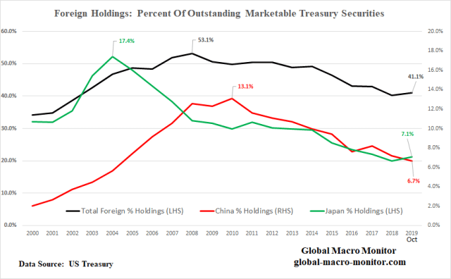
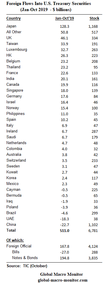
Foreign Inflows Into The Treasury Market
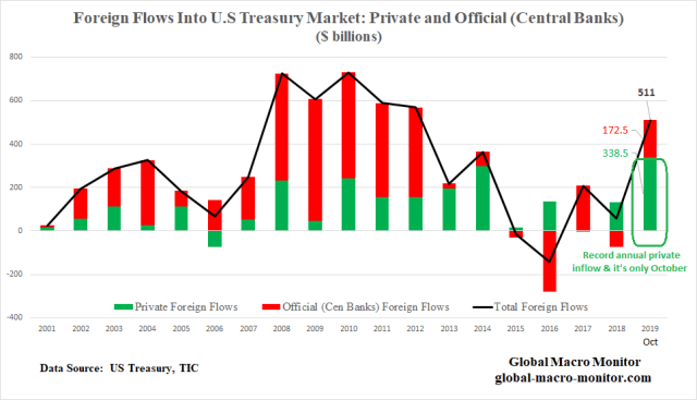
Private foreign flows into the Treasury market have already reached an all-time annual high at the end of October due to positive U.S. interest rate differentials and negative-yielding debt abroad.
Nonetheless, the foreign holdings as a proportion of the total stock of marketable Treasuries have fallen from a high of 53.1 percent to 41.1 percent in October. The proportion of China and Japan’s holdings of the marketable Treasuries has also declined significantly as their inflows (China flows are negative this year) have been outpaced by the growth of the stock of market debt.
Central Bank Holdings Of T-Bills And Coupon Curve
The Fed and foreign central banks still hold almost 50 percent of the U.S. coupon curve though central bank proportional holdings of T-Bills have fallen off precipitously, which is probably why the Fed is engaged in a fast and furious exercise to provide liquidity to the money markets. We’re not certain about this but it is our best-calculated guess.
It would be interesting to add the Fed’s current repo holdings to the last data point on the blue line. It does include recent purchases of T-Bills by in its SOMA portfolio, however.
In the following chart, it is easy to see why the S&P crashed in Q4 2018 due to a crowding-out effect, not so much from interest rates but that liquidity was sucked up and hoovered into the Treasury market. In 2018, marketable Treasury securities increased by $1.1 trillion and all of it, and then some were financed by non-central bank domestic sources.
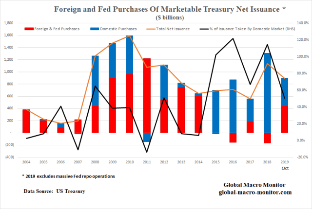
At the end of October 2019, the Treasury has issued $896 in marketable debt with around 50 percent financed domestically, which does not include the recent multiple rounds of repo operations by the Fed.
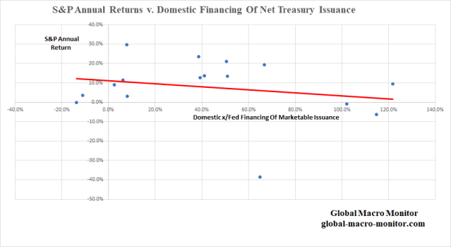
S&P Returns And Treasury Issuance
Finally, though the data is very noisy and there are many factors at play, we show in the graph below there is a negative correlation (ρ = -.22) with returns on the S&P and domestic financing of the marketable Treasury issuance. The data makes sense and we suspect digging deeper and adding more observations the actual correlation is much higher.
Keep It On Your Radar
Though policymakers and market wonks have completely ignored the debt, deficit, and this type of analysis, we think you should keep it on your radar, folks. We have zero doubt it will come back to bite the markets in the ass someday.
In fact, Alan Greenspan was out today warning,

See here for full Greenspan article.
Data Appendix


Pingback: About That Inverted Yield Curve, Coming Recession, and Repopocalypse | Global Macro Monitor