
Fed Chair, Jerome Powell finally admitted today, at least, implicitly, there is too much stimulus demand (in the macro context) in the global economy and the Fed will have to accelerate its tapering.
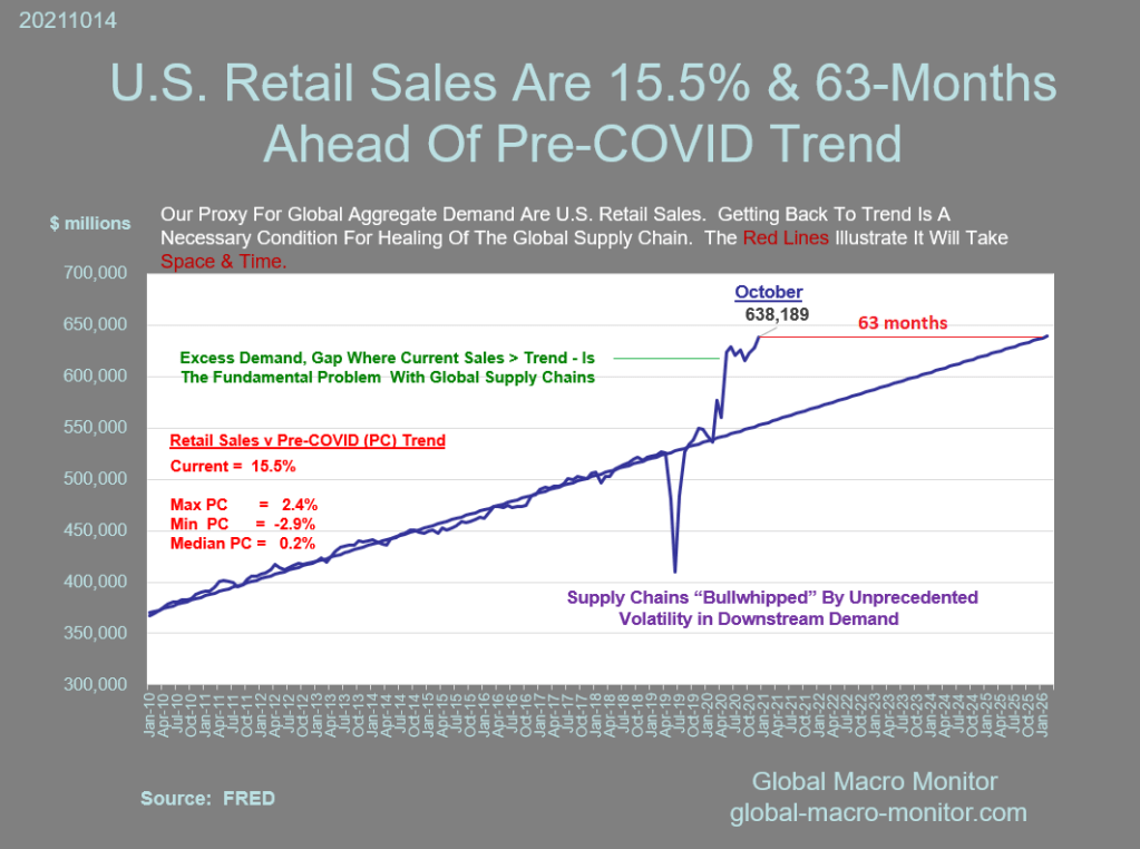
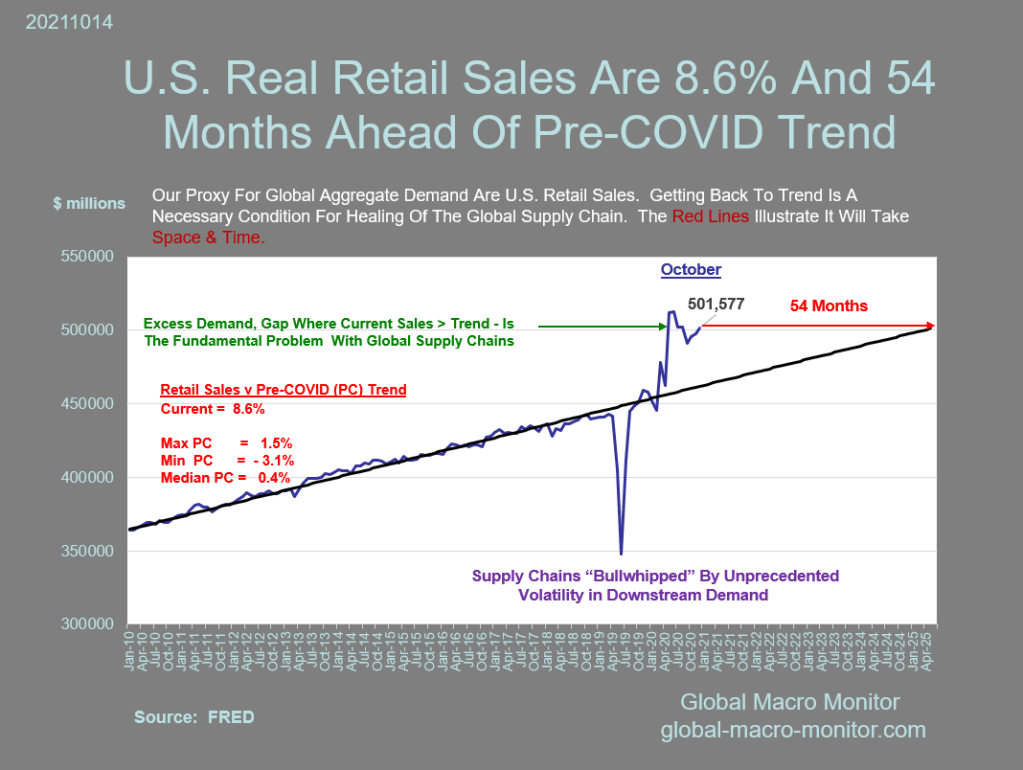
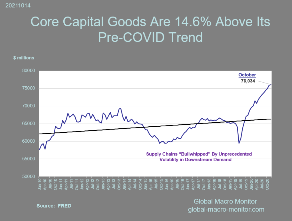
The following charts clearly illustrate the U.S. economy is overheating and is a major contributing factor to inflation. Nominal retail sales and core capital good shipments remain 15 percent above and years ahead of their pre-COVID trend. Think of the trend line as the supply curve.
In hindsight, it is easy to say the global policymakers overshot with their stimulus, but it is certainly better than the alternative and a deep recession/depression. Just as you and I, policymakers have to make decisions with imperfect information. Counterfactuals don’t go a long way in the political arena.
We think it is about time the FOMC finally starts to focus on the problems caused by the “money supply chain,” rather than blaming all the economic imbalances on “supply chain issues,” and it appears they have. If demand were not so strong, the supply chain issues would have worked themselves out long ago, and the Port of Los Angeles and Long Beach wouldn’t look the 405 freeway during rush hour.
As reflected in the charts below, the supply chain broke early during the pandemic as upstream suppliers were “bullwhipped” by the massive volatility in point-of-sale or end demand.
We believe the next inflection point, as the Fed keeps tapering and then tightening until something breaks, which leads to reversal and a new monetary regime, is a long way off.
Stay tuned.


Pingback: Are These The Charts That Spooked Jerome Powell? - Grand Ole Party
Pingback: Are These The Charts That Spooked Jerome Powell? - The Daily Conservative Report
Pingback: Are These The Charts That Spooked Jerome Powell? – Biz Patriot
Pingback: Are These The Charts That Spooked Jerome Powell? – Vigilant Veterans
Pingback: Are These The Charts That Spooked Jerome Powell? - ThinkCivics
Pingback: Are These The Charts That Spooked Jerome Powell? - Right USA
Pingback: Are These The Charts That Spooked Jerome Powell? – MAGAtoon
Pingback: Are These The Charts That Spooked Jerome Powell? – Understanding Deep Politics
Pingback: Are These The Charts That Spooked Jerome Powell?
Pingback: Are These The Charts That Spooked Jerome Powell? | ZeroHedge
Pingback: Are These The Charts That Spooked Jerome Powell? – Turn House RED
Pingback: Are These The Charts That Spooked Jerome Powell? – Sovereign Vision
Pingback: Are These The Charts That Spooked Jerome Powell? – Takin' It Back
Pingback: Are These The Charts That Spooked Jerome Powell? | New Covenant Network News
Pingback: Are These The Charts That Spooked Jerome Powell? - Nemos News Network
Pingback: Are These The Charts That Spooked Jerome Powell? - HEDGEaccordingly.com
Pingback: Are These The Charts That Spooked Jerome Powell? – Freedomizer Radio
Pingback: Are These The Charts That Spooked Jerome Powell? – Real News Aggregator
Pingback: Altstream Alternative News Source Are These The Charts That Spooked Jerome Powell?ZeroHedge News