The Charts That Explain All Things Macro

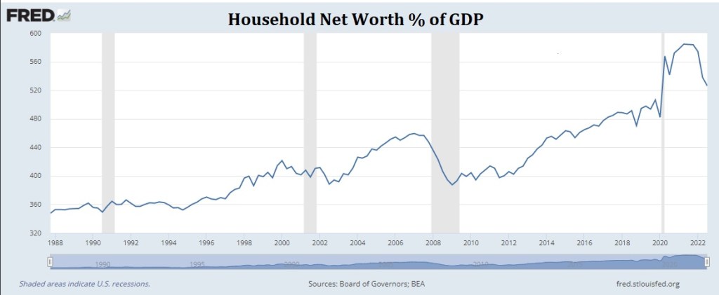
In our opinion, the economy’s unexpected mojo and sticky inflation can be explained in two simple macro charts.  M2 as a percent of GDP remains freakishly high, though we don’t put much stock in the old monetary aggregates, and Household Wealth as a percent of GDP remains off the historical charts.  

Two of the deadly inflationary sins:

1) Money for nothing
2) Wealth without production 

Levels matter.  

This entry was posted in Uncategorized. Bookmark the permalink.

Leave a Reply

Fill in your details below or click an icon to log in:

WordPress.com Logo

You are commenting using your WordPress.com account. Log Out /  Change )

Twitter picture

You are commenting using your Twitter account. Log Out /  Change )

Facebook photo

You are commenting using your Facebook account. Log Out /  Change )

Connecting to %s

This site uses Akismet to reduce spam. Learn how your comment data is processed.