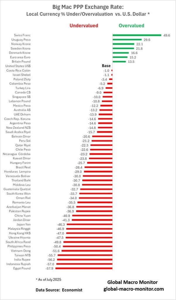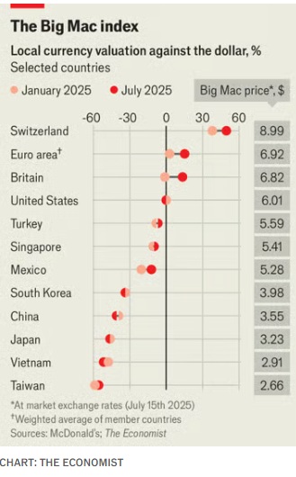
As an international economist earlier in my career, I long appreciated The Economist‘s Big Mac Index, a deceptively simple yet revealing tool for assessing purchasing power parity (PPP) and currency under or overvaluation. In the Economist’s latest iteration, the Index continues to spotlight the disparities between market exchange rates and what currencies should be worth based on the price of a McDonald’s Big Mac. At its core, the Big Mac Index compares the cost of the iconic burger across countries. If a Big Mac costs significantly less in one country than in the U.S. (when adjusted for exchange rates), that currency is likely undervalued—and vice versa.
Swissie Expensive
According to the recent update, the Swiss franc remains notably overvalued, while many Asian currencies, including the Chinese yuan and Japanese yen, appear undervalued. The dollar itself is still relatively strong, skewing valuations globally. The Big Mac Index, though informal, remains a useful shorthand for understanding real-world consumer purchasing power.
I remember a summer visit to Copenhagen, where a simple Big Mac meal cost me nearly $8 USD, while a Big Mac in the States was around $5 USD. It wasn’t just sticker shock; it was a vivid reminder of Denmark’s high cost of living and the krone’s strength. Contrast that with a later trip to Japan, where the same meal set me back just under $3 USD. The affordability wasn’t just a function of cheap labor or ingredients, but of broader macroeconomic factors, reflected, in part, in the undervalued yen.