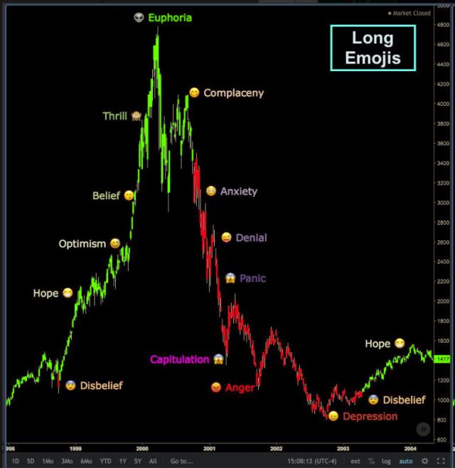
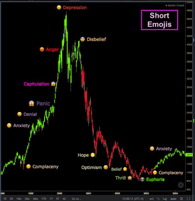
You heard it here first, comrades!
https://twitter.com/jameshasson20/status/1004096297316601856?s=21
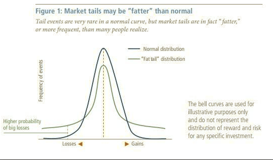
In a normal probability distribution…blue curve), the odds of risky outcomes (bad stuff happening) are thin at the extremes. In fat-tailed distributions, such outcomes have a greater chance of occurring (the [greenish] curve). Source
Non-normal distributions can be heavily skewed and unstable. – Decline of the Empire
Fat Tails In Real Life
If you have been following the Global Macro Monitor more than, say, a year, it should be clear by now we love living in the fat tails. That is we are natural contrarians, love to play devil’s advocate to and jackhammer the prevailing perma bullish narrative, and always looking for the next big move in the markets.
By fat tails, we mean more than a two standard deviation (sigma) move, which happens more often in the markets than they should in a normal distribution of returns. Ergo the “fat tails.”
Hawaii
In the past year, we have experienced some very high sigma events in real life. If you recall in April, we went on a short-term spring break. To where, you may ask?
The rim of the Kilauea volcano on the big island of Hawaii!
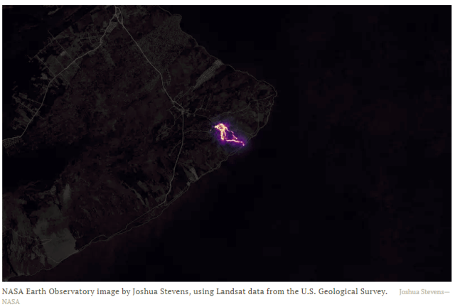
This just a few weeks before it blew. As my 15-year daughter perused the landscape, which looked like a scene from the surface of Mars, we snapped the following picture of the rim with my iPhone. Again, this was just a few weeks before it blew as illustrated in the subsequent images.
I recall thinking at the time that the probability is very low of a volcanic eruption but what if while we were here? I have lived through some very terrifying earthquakes, one that destroyed our home. However, being stuck in the middle of the giant Pacific while the volcanic island is blowing its top would be scary, especially when you have your youngest child with you.
In fact, I even thought of posting a piece about fat tails back then. While visiting the museum at the top of the rim, I came across a Richter scale that shows seismic activity usually significantly increases before an eruption. It was the inspiration for this quote,
Markets rarely fall out of the sky and usually signal something big is coming by a sharp rise in volatility. Think of a Richter scale before a volcano blows. – GMM, April 21
Pele is upset.
Pelehonuamea, to be exact. “She who shapes the sacred land.” In Hawaiian myth and culture, Pele is the goddess of fire and volcano and devours the Big Island when she is perturbed. She has a wicked temper and she made her home in the Halemaumau crater. – Washington Post
Kilauea is home to Pele, goddess of the volcano
Godspeed to our friends on the Big Island..



The October NorCal Fires
If you were tuned in to the Global Macro Monitor, you recall our experience fleeing from the flames of the October fires in Northern California. See here and here.
Those were some stressful daze. ‘
The lot just before the what looks like a Roman colonnade in the picture taken the morning after was our old home. Still stunned when I drive through the old neighborhood that something like that could have happened. Only one house is standing in the old track of about 600 homes.
I guess empirical probabilities become distorted relative to the logical probability when you wake up every morning and the sun still rises even though there were concerns and warnings that such a devastating fire could take place. I often thought of those warnings but dismissed them as a low probability “tail risk.”
We are now at ground zero of all that ills the housing market. The acute shortage of residential housing supply is driving rents sky high. The labor shortage coupled with increasing construction costs are making it difficult for contractors to build.
Regulatory red tape and the slow bureaucracy is adding to the difficult task of rebuilding. You can see in our old neighborhood not one lot is under construction more than eight months after the fire. The water was contaminated, and underground architecture was destroyed and needs rebuilding before residential construction can begin.
Many of the above problems in our local housing market are also reflected in the national housing market, which is fueling another price bubble. The current bubble is much different from the one experienced 2006-08, however, and driven not so much by leveraged buying but by the new supply-side economics. The price adjustment will therefore have much different dynamics.
Though devastating and one is too many lives lost the October fire was not even close to the devastation wreaked upon Puerto Rico and Houston from last year’s hurricane season.
Lessons Learned
What did we learn through all this?
Tail risk is real and more likely than a normal distribution foretells. Moreover, the real world and markets live in probability distributions with obese tails.
Finally, someday the quant driven trading algorithms are going to simultaneous short-circuit because they have their probability distributions wrong, causing a major market meltdown and significant damage to the global economy.


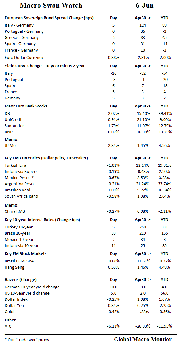
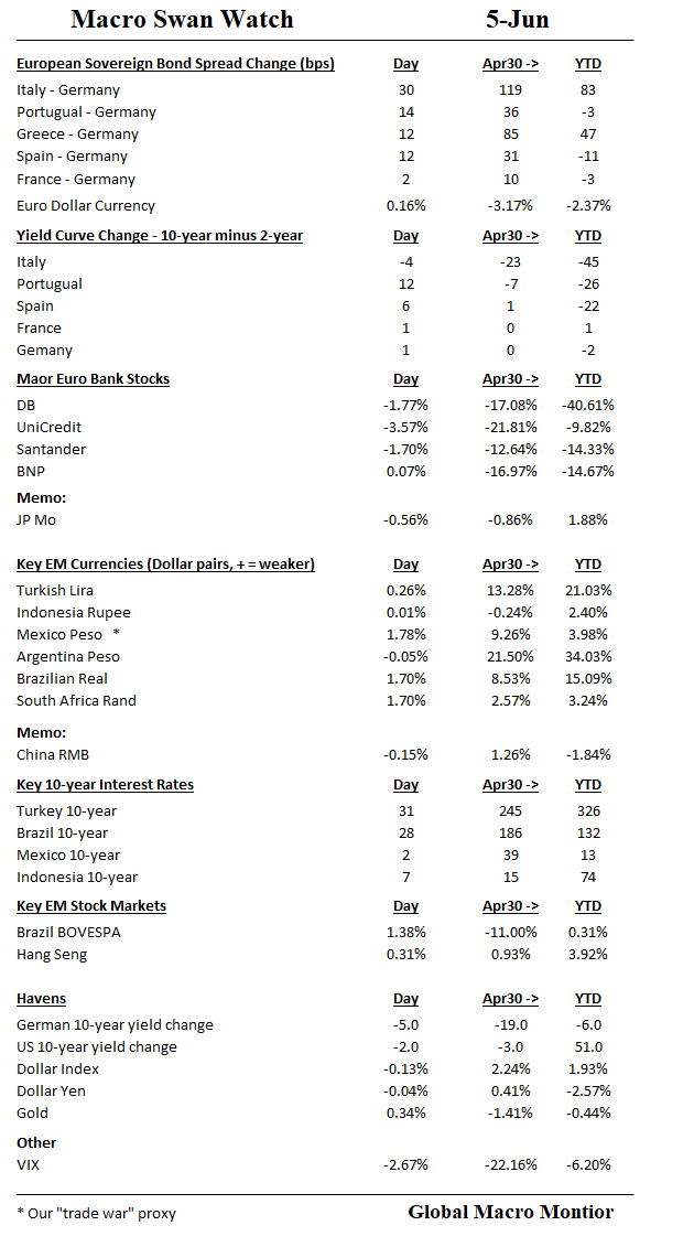
The swans were relatively well behaved today. Watch Brazil.
Significant move in Italian 2-year, up 35 bps, resulting in big curve flattener. Yields up across the board in Europe as ECB making noises QE is about to change.
Mario Draghi is on the verge of a watershed moment in the European Central Bank’s efforts to leave behind its crisis-fighting monetary policy
Chief Economist Peter Praet on Wednesday signaled the bank’s first formal round of talks on when to stop buying bonds is imminent. That would start the process of bringing down the curtain on stimulus efforts that have resulted in almost 2.5 trillion euros ($2.9 trillion) of bond purchases since 2015. – Bloomberg
The markets dismissed, though German and U.S. 10-year yields spike, the significance of what the ECB is signalling but that is what markets do when they are in bullish mode. The sun still comes up even with increasing risk and it follows must be time to hit the beach.
The risk markets want to move higher.
After weeks of negotiation the Italian Government is ready to get to work. But who are the key players?
… READ MORE : http://www.euronews.com/2018/06/06/it…
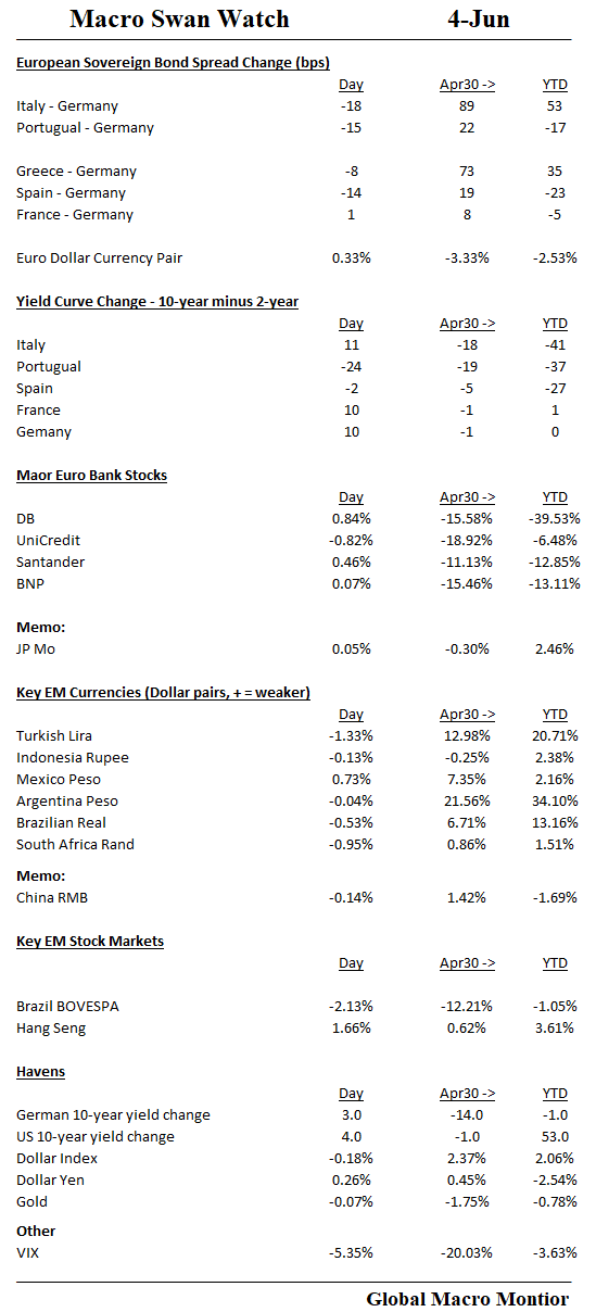
Swans behaving badly + VIX down = Complacency reigns

Interesting clip from Wired, interviewing a neuroscientist explaining how people get the sound Laurel and Yanny name so different.
The interview is profound if you take the principles and apply them to the markets. It’s all about reading the correct signals — such as low or high frequencies –to determine what you hear.
Money Quotes:
Neuroscientist: It sounds a lot like Yanny to me…The clip is distorted so it has a lot of high frequency information in it, more than usual. and I just might be better at hearing these high frequencies than you…
Q: What about hearing Laurel one day and Yanny the next?
Neuroscientist: That is mysterious and plays into our expectations…In psychology they call this a bistable illusion…
The difference between what speech sounds we hear depends on what frequencies are in those sounds…The difference between Laurel and Yanny is whether the information is low frequency, like Laurel, or high frequency, like Yanny.
Bistable illusion, indeed. I call it being whipsawed.
QE Effects
Our biggest critique of quantitative easing (QE) is that central banks have drowned out, or, at best, distorted market signals, making it much more difficult to read, access, trade, and invest in the markets.
The distorted market signals also result in extremely divergent market views and perceptions. You see a Laurel market, I see a Yanny market.
Some don’t care, however, and just want to make money, and to make money, you have to be in the game. As Chuck Prince infamously said,
As long as the music is playing, you’ve got to get up and dance, We’re still dancing – Chuck Prince, former Citigroup CEO, July 2007
That is probably where most of the market is, and certainly the modus operandi of Wall Street. It’s all about the year-end bonus, Che.
Distorted Signals
What is a U.S. 10-year bond yield at 3 percent signalling when nominal GDP is growing at 5 percent plus? What is the market signal of Portugal’s 10-year sovereign yield trading 117 bps through the U.S. 10-year note yield? Or a 10-year JGB at 5 bps? Does anyone care anymore?
It’s difficult to ascertain considering how the Fed and other central banks, who are not price sensitive, are majority owners in the U.S. and other sovereign yield curves.
Treasury Auctions
Even though QE ended in the U.S. in 2014, its legacy still hangs around in the Treasury auctions. The Fed, for example, took down around 20 percent of the U.S. Treasury auctions in May.
In order to constrain the direct financing of the Treasury by the central bank, the Federal Reserve Act only allowed the Fed to buy and sell Treasury securities in the secondary market. That changed after the great financial crisis (GFC) as the Fed’s SOMA portfolio regularly participates in the auctions, though with noncompetitive bids, as notes and bonds in their portfolio mature and a portion are reinvested back into the market. Technically, SOMA participation in Treasury auctions does not constitute direct financing.
Nevertheless, the Fed’s participation in the auctions still distorts the market clearing yield by allowing the U.S. government to issue more notes and bonds at a lower yield.
QT Will Start To Bind Fed Participation In Auctions
The quantitative tightening caps will step up to $30 billion per month in September and begin to exceed the amount of notes and bonds maturing in the SOMA portfolio. That is the Fed’s participation in the Treasury auctions will begin to wane, and in many months going forward, will be net zero.
We suspect when the market internalizes that the Fed will be out of most of the monthly auctions, interest rate volatility will increase at the same time the Treasury is ramping up supply. Our view of much higher long-term yields will then likely be realized.
As always, we may be wrong.
Stay tuned, Yanny.
The recovery in the European periphery continues.
Sell-offs when markets are in bullish mode now seem to act as an centripetal force to move financial assets back to their central point of bullish with great velocity. Similar to a gravity assist, the sell-offs bring in buyers which accelerate and propel markets to higher levels but often overshooting their fair value.
Euro Banks
The recovery is lagging in Europeans banks, which are woefully undercapitalized. We ran sum numbers over the weekend and, ironically, found the Italian banks are better capitalized than many French and German banks.
EM currencies were stronger today x/ Mexican Peso, which may now be a “trade war” proxy.
Havens sold off.
Financial markets want to be bullish.
Summary
Wow! That was one hot employment number on Friday, no? The best ever?
Here’s a tweet from the New York Times today citing a post on the paper’s TheUpshot blog. President Trump was all over it in his tweetfest today.
Yikes! Those euphoric headlines signal an economic top to us, they always do. Furthermore, they are completely absurd.
We perceive the Friday data as “this is about as good as it gets.”
How Good?
So, really, how good were the numbers? Relative to what, we ask?
In an absolute sense, the Friday’s jobs data were very good. They were extra tasty because the report outperformed expectations by 35k nonfarm payroll jobs. And who wouldn’t like a 3.8 percent unemployment rate?
The Trend Continues
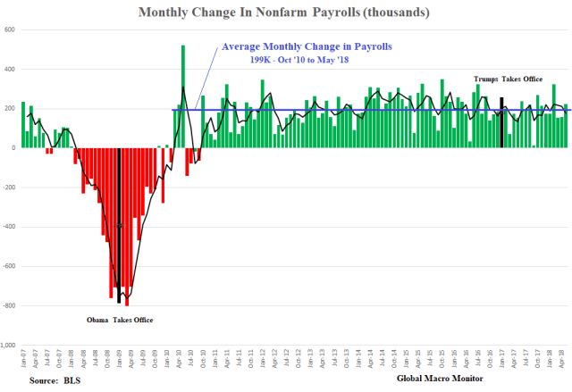
Relative to the almost eight-year trend of 92 straight months of positive job creation? Slightly above average.
The chart below illustrates Friday’s 223k increase in nonfarm payrolls was 24k above the 199k average monthly change of nonfarm payrolls since October 2010.
The sweet spot?
We worry the economy is starting to run up against labor constraints, and our concerns are magnified by the propensity or leanings of this administration to introduce distortions into the economy, such as trade tariffs. The sweet spot was during a period of more slack in the labor market.
President Trump’s Comps
Listen carefully to President’s Trump informal presser after his meeting with the North Korean spy chief on Friday, and you will hear his comparables are almost always relative to previous administrations. It is the case whether it on the economy or with respect to foreign policy.
Therefore we compare the data in President Trump’s first 16 payroll reports (February 2017 to May 2018) with the last 16 reports of President Obama’s administration (October 2015 to January 2017). Our analysis is an extension of last month’s comprehensive post, Deconstructing The U.S. Jobs Market.
Now we let the data speak.
Total Nonfarm Jobs Created
During the first 16 months of President Trump, the economy has created 2.966 million new jobs compared to President Obama’s 3.452 million, or 486k fewer jobs The private sector under President Trump has created 2.953 million jobs versus 3.180 million in the previous administration.
Even though the economy has grown almost 1 percent faster on an annual basis during the first five quarters under President Trump, job creation is lower. The positive is that the labor productivity must be increasing. However, it may be an indication the economy is also running up against labor constraints.
Average hourly earnings growth over the two 16-month periods have roughly been the same, with President Trump’s 3.58 percent earnings growth outperforming by 11 bps.

Industry Job Creation
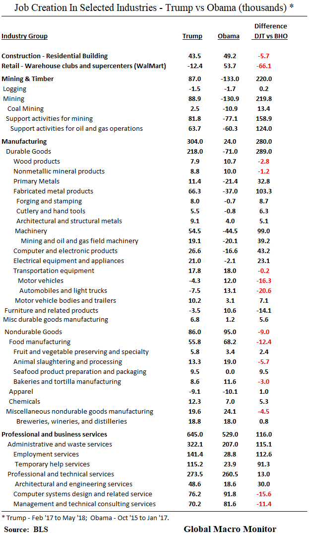
Job creation during President’ Trump tenure has outperformed in 6 of the 13 private sector industries, most notably in the mining and the manufacturing sector.
Most of the recovery in the mining sector is the result of higher oil prices, and almost all the gains have occurred in support activities for oil and gas operations. This was the same sector that lost most of the mining jobs during the Obama sample due to an ugly bear market in crude oil.
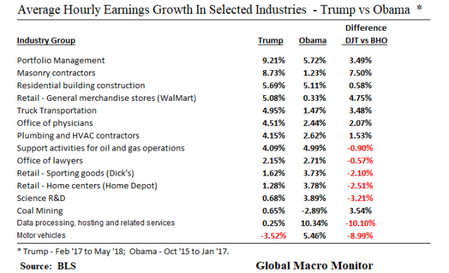
President Trump’s economy has underperformed with respect to average hourly earnings growth in 9 of the 13 private sector industry groups. Wage growth in financial activities has significantly outperformed under Trump and all other sectors. The populist tension between Wall Street and Main Street continues.

Manufacturing and Mining
At a more micro level, almost 25 percent of the manufacturing job increases under President Trump has been in food manufacturing, and beer pubs and wineries. About 60 percent of manufacturing employment increases has been in fabricated metals and machinery.
There has been de minimis job creation in the poster children of manufacturing, such as the steel industry, and actual job losses in the auto industry.
Note also the 20k increase in oil and gas machinery, which reflects a further boost to job creation of high oil prices.
However, a higher oil price is a zero-sum game as it reduces employment in other sectors, primarily related to the consumer, as real incomes decline. We estimate the average driver will pay an additional $400 per year for gas if prices remain up here, which consumes almost of the net income gain from the tax cuts.
There have been only 2,500 new coal mining jobs created under President Trump but this does represent a reversal of the job losses under President Obama.
Who Is Getting A Raise?
The following table illustrates the average hourly earnings increase in various industry groups. Portfolio managers and their entourage are happy as are bricklayers, construction workers, truck drivers and plumbers who are experiencing robust wage growth.
The 5 percent average hourly earnings growth at general merchandise stores, such as WalMart, the largest private sector employer in many states, corresponds with a 12.4k loss in jobs at warehouse clubs and supercenters (see above table). This either indicates a very tight labor market, the impact of minimum wage increases, social and political pressures on wages, technology, and the Amazon effect, or all of the above.
The auto worker continues to get hammered. It could be one reason why President Trump is taking such a hard line in the NAFTA negotiations, and an indicator that compromise is not going to be an option.
Tax Cuts
Finally, we take a quick look at the macroeconomic impact of the tax cut.
Thus far, it is mixed, and hardly lives up to the hype we see some in administration touting. It is still early in the game, however.
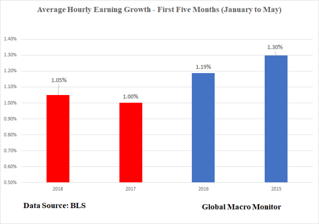
Nevertheless, job growth in the first five months of 2018 is doing better than the prior two years, but lower than 2015. Average hourly earnings growth, though higher than the first five months of 2017, is lower than the last two years of the Obama administration.

Internalizing this Ralph Waldo Emerson quote is essential for every successful trader.

Love this. Based on the cycle of market emotions.
Wonder if there is an algo out there that trades on emojis? Would not doubt it.
Hat tip Kazonomics!