The data speaks for itself.
Real Effective Fed Funds Rate (REFFR)
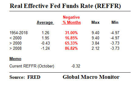
The real effective Fed Funds rate (REFFR), the Federal Reserve’s target rate of overnight commercial bank reserves lending rate less the CPI year-on-year change, remains negative for the 36th consecutive month.
The REFFR has been negative during 87 percent of the months since the beginning of 2008, and 65 percent of the months this century, compared to just 17 percent in the months from 1954 to 2000. If, anything is crazy, that is just plain nuts!
If they are already whining about the Fed with a still negative real fed funds rate is there is any hope of weaning the markets and economy from the crack? A perpetual bull market is not an entitlement, folks, even though some seem to think so.
The REER monthly average since 2000 has been -0.43 percent compared to 1.95 percent from 1954 to 2000.
In other words, the Fed has been performing triage and has kept the economy in the ICU for most of the 21st century. Not exactly a strong economy, in our book.
Balance Sheet
What’s getting tighter is the liquidity withdrawal due the Fed’s declining balance sheet, which is down equivalent to -$265 billion, or about 6.75 percent of the end-Sept ‘17 monetary base, when the balance sheet reduction began.
Note the projected monthly roll off of the SOMA’s Treasury portfolio by the red bars in the below graph. We estimate the Fed is set to reduce its balance sheet by another $125, including its MBS portfolio, in Q4.