COTD: Pain In Global Bond Portfolios

Lots of pain out there over the past few months in global bond portfolios.

Look at the reach for duration as global interest rates fell in the IMF chart below,  The IMF probably created the chart in late August/early September.  Compare to the chart of the change in 10-year bond yields since the beginning of November.

Central banks have certainly taken a hit on their QE bond purchases.

Other bodies soon to surface?

global-bond-portfolio-duration_dec26change-in-ten-year-yields_dec26

(COTD = Chart of the Day)


Posted in Uncategorized | Leave a comment

Heavy Drinking Americans And Seasonal Adjustment

Interesting piece in WashPost the other day,  Where the heaviest-drinking Americans live

hitting-the-sauce_dec26

…who among us is likely to do the most drinking this holiday season? The Department of Health and Human Services recently updated the official federal statistics on the percent of state residents ages 12 and older who drink at least once a month. Here’s a map of how those figures break down by state for the years 2014 and 2015.

New England is home to the nation’s heaviest drinkers — New Hampshire, where about 64 percent of residents age of 12 or older drink monthly, is tops in the country. Vermont, Maine and Connecticut also come in at drinking rates above 60 percent. Hard-drinking cheeseheads in Wisconsin see to it that their home is the only Midwestern state in the top tier of American drinkers.

The next tier of heavy drinking states are all in the northern part of the country. Some researchers posit that there may be a relationship between heavy drinking and latitude — at the country level, alcohol consumption tends to increase the farther you get away from the equator. This could be a function of the potential for boredom and depression during winter months when the nights are long, the days are short, and baby it’s cold outside — for a prime example of this, see recent stories involving alcohol and misconduct among people who live in Antarctica.

…But other cultural factors can attenuate this relationship. On the map above, take a look at Utah and particularly Idaho. They’re in the bottom tier of the states for drinking frequency. Utah, where only 31 percent of adults drink in a given month, comes in dead last. This is almost certainly because of the large Mormon populations in those states — 58 percent of Utahans are Mormon, as are 24 percent of people in Idaho. Mormonism generally prohibits the use of alcohol and other drugs.

There’s likely a similar religious influence in places Alabama, Mississippi and the other Southern states where drinking is low. Those states have large evangelical Christian populations, many of whom are abstainers.

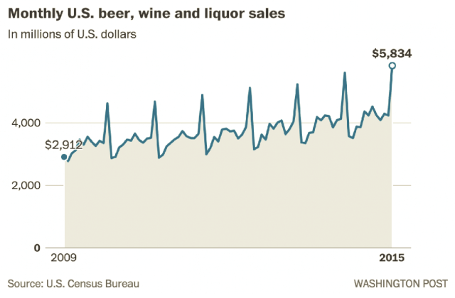
And the monthly data show why seasonal adjustments are necessary when crunching the numbers:

there’s no doubt that the holidays have traditionally been a time for boozing it up. Take a gander, for instance, at the total monthly alcohol sales in the United States. If you squint really hard you may detect a seasonal trend — those spikes are December of each year.

montly-beer-and-wine-liquor-salesGreat info for “cocktail” conversations about the Nation’s cocktail habits, no?

Posted in Economics, Food Prices, General Interest | Tagged , , | 1 Comment

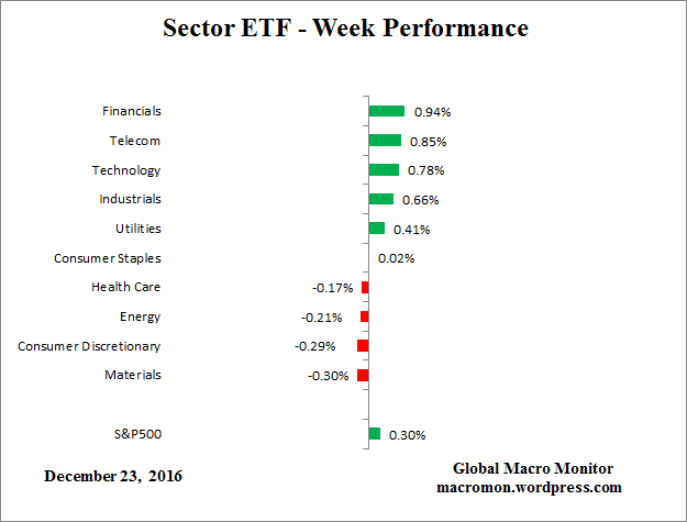
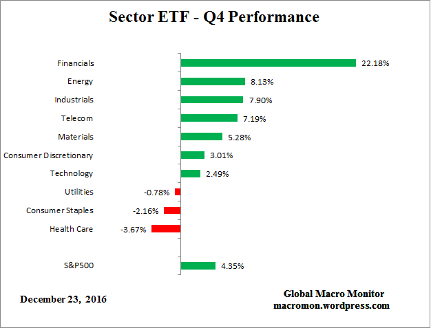
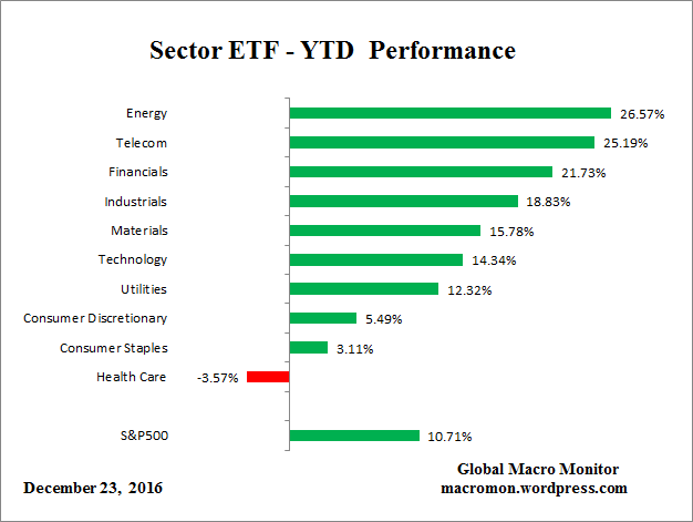
US Sector ETF Performance – Dec 23

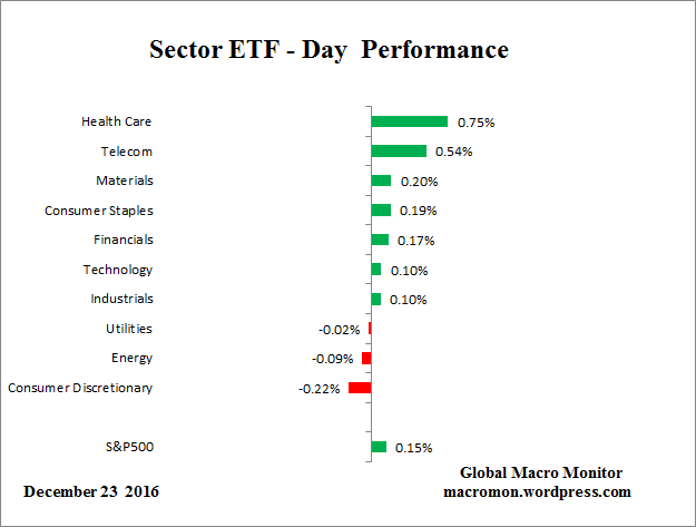
etf_detf_wetf_q4etf_ytd

Posted in Sector ETF Peformance, Uncategorized | Tagged | Leave a comment

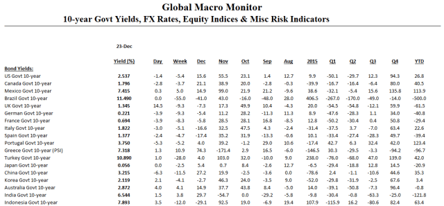
Daily Risk Monitor – December 23

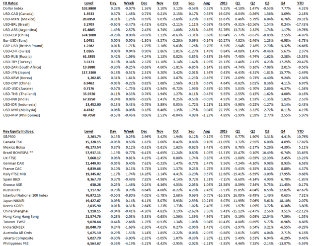
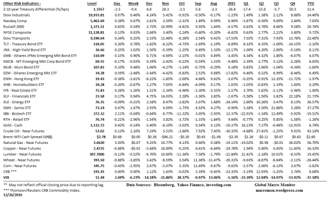
Click on table to enlarge and for better resolution

riskmon_1riskmon_2riskmon_3


Posted in Daily Risk Monitor, Uncategorized | Tagged , , , , , | Leave a comment

Quote of the Day (QOTD)

Remember: Prices drive narratives.   – Eddy Elfenbein

Or, as we like to say,  “analysts retrofit fundamentals to the price action.”

Posted in Quote of the Day | Tagged | Leave a comment

Merry Christmas, Folks!

Thanks for tuning in this year and staying with us.  Lots of good things to come in the New Year.

Let us raise some Christmas cheer the progress we have have made over the past two centuries and end with a Killer Christmas song.  Listen to those words!


the-world-as-100-people_dec25

Hat tip, Bill Easterly

Posted in Economics, Uncategorized | Tagged , , , | Leave a comment

COTD: Big Oil

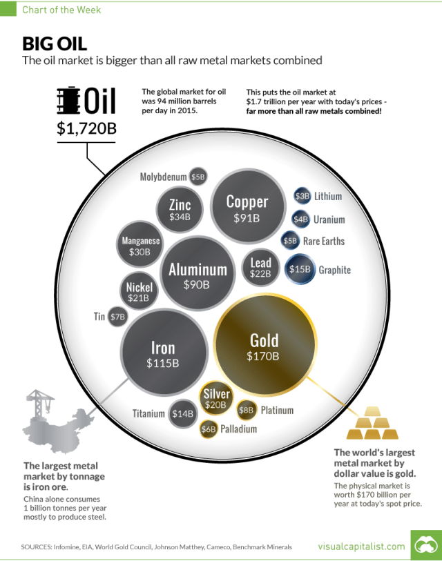
Our chart of the day (COTD) comes to from the Visual Capitalist.    

First, some context from their website,

The Chart of the Week is a weekly Visual Capitalist feature on Fridays.

Ever since the invention of the internal combustion engine, oil has been one of the most crucial commodities on Earth. Without it, modern transportation as we know it would not be possible. Industries such as aviation, aerospace, automobiles, shipping, and the military would look nothing like they do today.

Of course, as we now know, this has all come with some extreme drawbacks from an environmental perspective. And while new green technology and the lithium revolution will aid in eventually reducing the role of oil in transportation, the fact is we still use 94 million barrels per day of crude worldwide.

As a result, the energy industry continues to have huge amounts of influence on our lives. Special interest groups with a focus on energy have influence on a domestic level. Meanwhile, from a foreign policy angle, countries like Saudi Arabia and Russia wield additional geopolitical and economic power because of their natural resources. It’s even arguable that everything from the Gulf War to the more recent Middle East interventions in Libya, Syria, and Iraq have been at least partially to do with oil.

This week’s chart of the week aims to help explain the influence that oil has on countries and markets by using a very simple perspective: the size of the oil market vs. all metal markets combined.

The True Size of the Oil Market

While the amount of uses in one barrel of oil is quite incredible, we still need a mind-boggling amount of the natural resource each year to sustain consumption.

Oil production per year: 34 billion barrels (incl. other liquids)
Oil market size at current prices: $1.7 trillion per year

To consider how big this actually is, we compare the annual market sizes of all major metals and minerals that are mined throughout the world:

  • Gold: $170 billion
  • Iron: $115 billion
  • Copper: $91 billion
  • Aluminum: $90 billion
  • Zinc: $34 billion
  • Manganese: $30 billion
  • Nickel: $21 billion
  • Silver: $20 billion
  • Other metals: $67 billion (Including platinum, palladium, titanium, tin, moly, uranium, and more)

The total amount works out to $660 billion – just a tiny fraction of the size of the oil market.

Oil v Commodities_Chart_Dec22.png

Hat Tip,  The Polish Oil Trader,  Doug Skrypek

Posted in Crude Oil, Uncategorized | Tagged , , | Leave a comment

COTD: Executive Orders by President

Nice chart by the Daily Dot coming to us via King David over at  Think In The Morning.  Check out his blog, one of the smartest economists we know.

The data totally contradict the meme that President Obama is the ‘King of the Presidential Executive Order’ and chooses to rule by fiat rather than working with Congress.   Ronald Reagan signed 381 executive orders versus President Obama’s 260.  Of course, that will change as Obama leaves office, but using the current data from the chart, President Reagan signed almost 50 percent more executive orders than has President Obama!

Welcome to the post-truth world, folks, where  “facts are just political opinions”.  All the rage, no?

We will never pass up an opportunity to preach the words of Thomas Jefferson as our Democracy slides into a bear market, which we hope is just cyclical and not secular.  We fear the later, however.

“If a nation expects to be ignorant and free in a state of civilization, it expects what never was and never will be.  If we are to guard against ignorance and remain free, it is the responsibility of every American to be informed.”  – Thomas Jefferson

Those f%*king iPhones, gadgets, and the internet that distract us from pursuing the truth — and, furthermore, distorts it with fake news, etc.!   Walter Cronkite where are you?

Here is some good commentary on the chart from Daily Dot,

Every U.S. president from George Washington to George W. Bush has issued presidential executive orders to implement policies without Congress. Several have issued executive orders that revoked those of former presidents. According to the Congressional Research Service, a pair of Bush executive orders changed an executive order by predecessor Bill Clinton which further modified executive orders by Ronald Reagan which he issued to replace those issued by Jimmy Carter. Obama was able to eliminate these all with a single executive order. 

…Republicans argue that Obama’s executive orders are too plentiful and try to do too much without the input of the legislative branch. House Republicans even authorized a six-month task force to study the impact of what they believe to be an unprecedented use of executive powers in the Obama administration.

“This threat that the president’s going to run the government with an ink pen and executive orders, we’ve never had a president with that level of audacity and that level of contempt for his own oath of office,” Rep. Steve King (R-IA), the task force’s chairman, said on CNN. 

Meanwhile, the White House pointed out that—at least numbers-wise— Obama isn’t the worst offender when it comes to executive orders…

..using data from the American Presidency Project at the University of California, Santa Barbara, the Daily Dot ranked all the U.S. presidents by the number of executive orders they issued while in office. 

presidential-executive-orders

(COTD = Chart of the Day)

Posted in Politics, Uncategorized | Tagged , | 1 Comment

World Consumer Inflation Rates

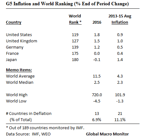
We have ranked the world’s 2016 consumer inflation rates by country in the ginormous table below.  The data are from the October 2016 IMF’s World Economic Outlook database.  Note, 2016 are IMF estimates.

But, first, check out the low inflation, but rising x/ Japan, rates foe the G5,  and some interesting central tendency measure inflation rates for the world.

Global inflation running just about “Goldilocks”, no?   Note the difference from the  median and average country inflation rates.  Skewed by the top 5 countries.

g5_inflation_dec19world_inflation_dec19


Posted in Inflation/Deflation, Uncategorized | Tagged , , , | Leave a comment