
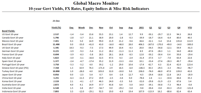
Click on table to enlarge and for better resolution
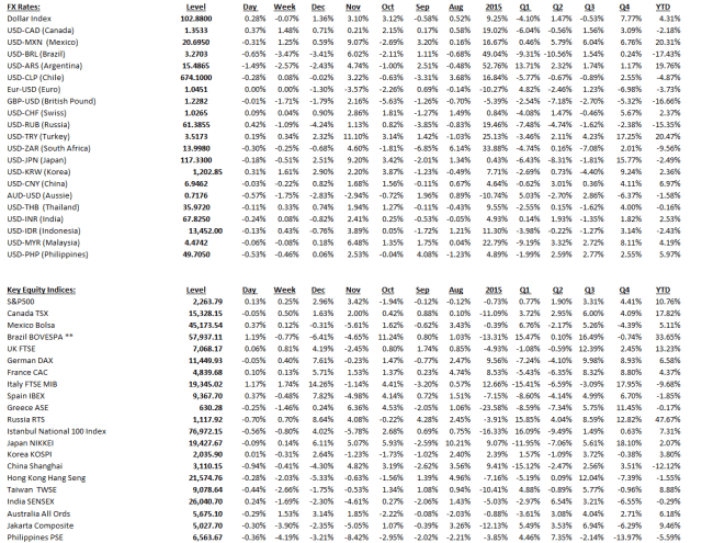
Click on table to enlarge and for better resolution
Remember: Prices drive narratives. – Eddy Elfenbein
Or, as we like to say, “analysts retrofit fundamentals to the price action.”
Thanks for tuning in this year and staying with us. Lots of good things to come in the New Year.
Let us raise some Christmas cheer the progress we have have made over the past two centuries and end with a Killer Christmas song. Listen to those words!

Hat tip, Bill Easterly
Our chart of the day (COTD) comes to from the Visual Capitalist.
First, some context from their website,
The Chart of the Week is a weekly Visual Capitalist feature on Fridays.
Ever since the invention of the internal combustion engine, oil has been one of the most crucial commodities on Earth. Without it, modern transportation as we know it would not be possible. Industries such as aviation, aerospace, automobiles, shipping, and the military would look nothing like they do today.
Of course, as we now know, this has all come with some extreme drawbacks from an environmental perspective. And while new green technology and the lithium revolution will aid in eventually reducing the role of oil in transportation, the fact is we still use 94 million barrels per day of crude worldwide.
As a result, the energy industry continues to have huge amounts of influence on our lives. Special interest groups with a focus on energy have influence on a domestic level. Meanwhile, from a foreign policy angle, countries like Saudi Arabia and Russia wield additional geopolitical and economic power because of their natural resources. It’s even arguable that everything from the Gulf War to the more recent Middle East interventions in Libya, Syria, and Iraq have been at least partially to do with oil.
This week’s chart of the week aims to help explain the influence that oil has on countries and markets by using a very simple perspective: the size of the oil market vs. all metal markets combined.
The True Size of the Oil Market
While the amount of uses in one barrel of oil is quite incredible, we still need a mind-boggling amount of the natural resource each year to sustain consumption.
Oil production per year: 34 billion barrels (incl. other liquids)
Oil market size at current prices: $1.7 trillion per yearTo consider how big this actually is, we compare the annual market sizes of all major metals and minerals that are mined throughout the world:
- Gold: $170 billion
- Iron: $115 billion
- Copper: $91 billion
- Aluminum: $90 billion
- Zinc: $34 billion
- Manganese: $30 billion
- Nickel: $21 billion
- Silver: $20 billion
- Other metals: $67 billion (Including platinum, palladium, titanium, tin, moly, uranium, and more)
The total amount works out to $660 billion – just a tiny fraction of the size of the oil market.
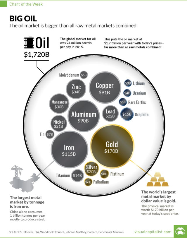
Hat Tip, The Polish Oil Trader, Doug Skrypek
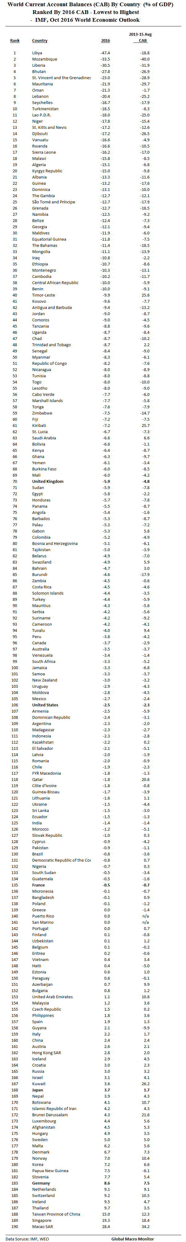
We have ranked the world’s 2016 Current Account Balances (CAB) by country from largest deficit to largest surplus in the ginormous table below. The data are from the October 2016 IMF’s World Economic Outlook database. Note, 2016 are IMF estimates.
But, first, check out the current account balances of the G20. The world has come along way from the big imbalances at the beginning of the Obama Administration, x/ Germany. Note, only seven countries of the 190 that the IMF monitors has a larger current account surplus with respect to GDP than Germany.
Some economists argue that a large current account surplus limits growth in other countries. German exports to other countries but is not important. The large current account surplus and undervaluation of currency was good for Germany, but it was holding back exports in other countries. If Germany boosted domestic demand and allowed slightly higher domestic inflation, they would provide a much needed boost to global demand and help to overcome unemployment in other countries.
The real problem of the German current account surplus is not for the US (they can still devalue against the Euro and have their own monetary policy). The real problem is faced by countries in the south of Europe who are experiencing severely depressed domestic demand.
Given the imbalances in the Eurozone, southern European economies face a long period of deflation as they slowly seek to restore competitiveness against their northern competitors. However, given European wide austerity, this period of deflation is proving very costly in terms of lost GDP and high unemployment.
If Germany was willing to boost domestic consumption, and temporarily target higher inflation, this would provide greater export demand within Europe. A lower German current account surplus would help increase economic growth in southern Europe. Given the debt crisis and lack of growth, export led growth would be very welcome for easing the depth of the recession.
However, Germany is currently unwilling to pursue any policy which risks a slight deviation from the inflation target. (The ECB increased interest rates in 2011 over concerns about inflation). Therefore, with domestic demand constrained, the German current account surplus is likely to remain. This will be a factor in keeping demand elsewhere in Europe depressed. – Economics Help
G20 current account balances,
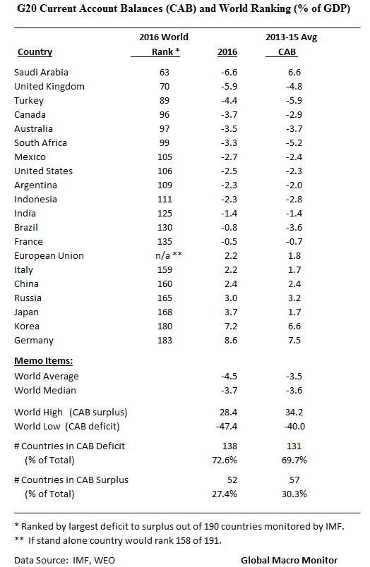
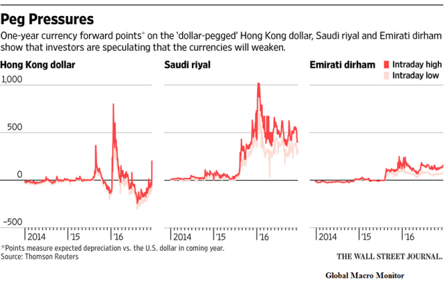
What stands out is the big flip in Saudi Arabia. A perennial exporter of foreign savings, the Kingdom is now running a current account deficit and has to import capital or use up foreign reserves to support it and maintain a stable exchange rate. The Saudi currency and financial markets have come under pressure as the current account surplus has flipped to deficit due to the collapse in oil prices. Hence their desperation to raise oil prices.
The next few years are going to be interesting. If Mr. Trump gets his fiscal policy approved and implemented – large tax cuts and large increases in fiscal spending — by definition, the U.S. current account deficit is going to explode as it did under President Reagan, moving from a small surplus in 1980 to a deficit in 1987 of 3.3 percent in 1987.
Remember the National Accounting Identity,
(S-I) + (T-G) = (X-M)
(S-I) is the ‘private savings balance’ or the difference between private sector savings (S) and investment (I); (T-G) is the ‘government balance’ or the difference between tax receipts (T) and all government expenditure (G); (X-M) is the difference between exports (X) and imports (M) and is usually called the simple ‘current account balance’. –
Given future fiscal policy, unless, private investment or consumption (savings increases) collapses – which is contrary to expectations they both will increase — coupled with a stronger dollar, which we think the index goes to 120 due to rising relative real U.S. interest rates: Presto! — an exploding current account deficit. That “sucking sound” (somethings never change) you will hear in the next few years will be capital flowing in to the U.S. from the rest of the world.
President Trump will thus be very conflicted as we know he doesn’t like trade deficits.
Sum of Current Account Balances
Like all data, there are discrepancies in the IMF data. The world’s current accounts should some to zero. That is, individual current account balances are a zero sum game.
In theory, the sum of world current account balances should be zero. In practice, it never is, and discrepancies can be large. Where do they come from, and what can be done about them? – IMF
Nice chart by the Daily Dot coming to us via King David over at Think In The Morning. Check out his blog, one of the smartest economists we know.
The data totally contradict the meme that President Obama is the ‘King of the Presidential Executive Order’ and chooses to rule by fiat rather than working with Congress. Ronald Reagan signed 381 executive orders versus President Obama’s 260. Of course, that will change as Obama leaves office, but using the current data from the chart, President Reagan signed almost 50 percent more executive orders than has President Obama!
Welcome to the post-truth world, folks, where “facts are just political opinions”. All the rage, no?
We will never pass up an opportunity to preach the words of Thomas Jefferson as our Democracy slides into a bear market, which we hope is just cyclical and not secular. We fear the later, however.
“If a nation expects to be ignorant and free in a state of civilization, it expects what never was and never will be. If we are to guard against ignorance and remain free, it is the responsibility of every American to be informed.” – Thomas Jefferson
Those f%*king iPhones, gadgets, and the internet that distract us from pursuing the truth — and, furthermore, distorts it with fake news, etc.! Walter Cronkite where are you?
Here is some good commentary on the chart from Daily Dot,
Every U.S. president from George Washington to George W. Bush has issued presidential executive orders to implement policies without Congress. Several have issued executive orders that revoked those of former presidents. According to the Congressional Research Service, a pair of Bush executive orders changed an executive order by predecessor Bill Clinton which further modified executive orders by Ronald Reagan which he issued to replace those issued by Jimmy Carter. Obama was able to eliminate these all with a single executive order.
…Republicans argue that Obama’s executive orders are too plentiful and try to do too much without the input of the legislative branch. House Republicans even authorized a six-month task force to study the impact of what they believe to be an unprecedented use of executive powers in the Obama administration.
“This threat that the president’s going to run the government with an ink pen and executive orders, we’ve never had a president with that level of audacity and that level of contempt for his own oath of office,” Rep. Steve King (R-IA), the task force’s chairman, said on CNN.
Meanwhile, the White House pointed out that—at least numbers-wise— Obama isn’t the worst offender when it comes to executive orders…
..using data from the American Presidency Project at the University of California, Santa Barbara, the Daily Dot ranked all the U.S. presidents by the number of executive orders they issued while in office.

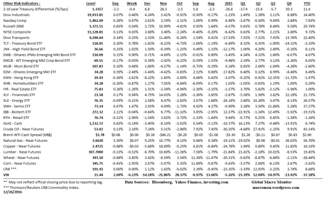
(COTD = Chart of the Day)
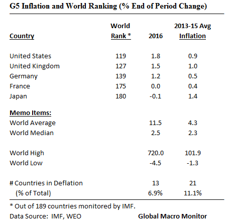
We have ranked the world’s 2016 consumer inflation rates by country in the ginormous table below. The data are from the October 2016 IMF’s World Economic Outlook database. Note, 2016 are IMF estimates.
But, first, check out the low inflation, but rising x/ Japan, rates foe the G5, and some interesting central tendency measure inflation rates for the world.
Global inflation running just about “Goldilocks”, no? Note the difference from the median and average country inflation rates. Skewed by the top 5 countries.

Folks, easy money/ conusmer credit almost always moves consumption forward and robs from the future. Not the case with capital investment and capital accumulation however, which are the foundations of growth.
I posit the slow growth in the G5 is now experiencing, as posted in our last piece, is the result of too much consumer borrowing and thus pulling consumption forward.
Isn’t that exactly what is happening here to GM car sales now? The overhang of too much credit and the bursting of the subprime auto credit bubble?

Hat Tip to Wolf Richter Twitter.
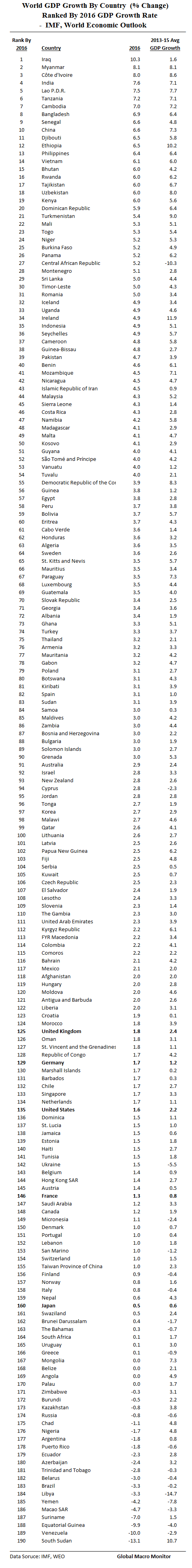
We have ranked the world’s country 2016 GDP growth rates in the ginormous table below. The data are from the October 2016 IMF’s World Economic Outlook database.
But, first, check out the dismal economic performance of the G5 economies.

Nice chart/infographic, Where do our raw materials come from?
From the BullionVault,
WHICH countries produce the raw materials we all need and use every day? Who mines the copper, grows the timber, makes the cement and harvests the coffee all fueling our modern lives?
BullionVault’s latest infographic shows the global output in Dollar terms of the world’s most important natural resources and raw materials, plus the top 3 countries where they originate.
China dominates the production of many natural resources. In fact, of the 17 substances below, China is the largest producer of 9 of them. China produces a staggering amount of silk (84%), lead (52%) and coal (47%). Meanwhile, Latin American countries lead the production of coffee beans and silver.
In 2015, China was also the biggest gold-producing country for the 7th year running, responsible for 14% of world mining output, while Mexico produced 21% of the world’s silver and South Africa turned out a massive 71% of all the world’s platinum.
Take a look at the infographic below to discover which countries lead production of the raw materials we all rely on.

(COTD – Chart of the Day)

