Cue FED

Here’s some interesting data the Fed is surely looking at.

The monetary base has been flat lining since the end of QE2 —  i.e., the balance sheet growth of the Federal Reserve has not been above long-term growth.  May explain the punk performance of gold.

The monetary aggregates, as reflected in M2 growth, though healthy, has slowed somewhat. Bank credit is growing at about 5 percent y/y, which reflects a slow healing of the financial sector, but still not at 100 percent health.

Furthermore,  the shadow banking system is a still a shadow of its former itself with respect to credit expansion.   Thus, relatively flat base growth and slowing M2 (though less relevant) makes us think the Fed will remain aggressive.   Stay tuned.

Dec10_Money Supply(click here if charts are not observable)

Posted in Gold, Monetary Policy | Tagged , , , | 2 Comments

Chinese Electricity Production

Nice graphic.   A little more orange, a little less black.  This reflects an economy not booming, not tanking, but accelerating out of a sharp slowdown.   We have not idea at what growth rate, however.

BTW,  orange and black — the color of the World Champs.

Dec9_China Electricty Production

(click here if graphic is not observable)

Posted in China | Tagged , | 2 Comments

Nonlinear Thinking: Breast Tissue Screening Bra

This is very cool, especially given that we have three daughters. One of our favorite trends is mobile medical applications and devices.

How do these rapid technological advances fit into macroeconomic models?  Most forecasts are going to be so far from reality.  Nonlinear thinking, folks!

Introducing the future of breast tissue screening, the First Warning Systems’ Breast Tissue Screening Bra to assist in the breast self exam (BSE) offering a quantified analysis of what an individual is seeing and feeling when performing a BSE.

Learn more athttp://www.firstwarningsystems.com/

(click here if video is not observable) 

Posted in Nonlinear Thinking | Tagged , , | 1 Comment

Global Wage Growth

Interesting data from the latest Global Wage Report from the International Labor Organization.

The following table illustrates the cumulative increase in real wages since 2000.  Note the marked differences across regions.  In Asia,  real wages have nearly doubled while only increasing by 5 percent in developed economies.  Also note the decline in the real wage in the Middle East, which is partially a reflection of the region’s current political instability.

Dec9_Wage Growth3Dec9_Wage GrowthDec9_Wage Growth2

In spite of the rapid growth of real wages in certain regions,  the absolute differences in wages across countries is still large.  This is reflected in the following chart with wage estimates from the U.S. Bureau of Labor and Statistics.   Using a different methodology, the ILO estimated total hourly compensation costs at US$1.36 in China for 2008 and US$1.17 in India for 2007.  Though these data can change with exchange rate fluctuations,  they do illustrate the still large wide manufacturing wage gap among nations.

Dec9_Manufacturing Wages(click here if charts are not observable)

Posted in Employment, Wages | 5 Comments

What Economists At Harvard Are Thinking

Cute.  The Mankiw is starting to look…wise, no?

Hat tip Mashable. 

(click here if video is not observable)

Posted in Economics, General Interest | Tagged , | Leave a comment

China’s Foreign Direct Investment

Excellent ginormous infographic from Firmex on China’s investment trends.

Amid the global economic slowdown, 2012 has shaped up to be a healthy year for Chinese investment abroad. According to a recent PwC report, China’s outbound deal values tripled in the first half of 2012. 

Some of the biggest transactions to have transpired this year in North America include the impending $15.1 billion CNOOC – Nexen deal, and Dalian Wanda’s $2.6 billion acquisition of AMC Entertainment.

Dec9_China FDI

(click here if infographic is not observable)

Posted in China | Tagged , | 2 Comments

Apple’s Key Fibonacci Levels

Great chart from Motivewave.com via Susie Q over at Stock Twits.

Apple just can’t hold a bid since its big bounce off  $505 on November 16th.  It either opens at its high and trades down all day,  or gaps down at the open, bounces and trades lower.   Watch to see if this pattern can be broken.

The bears are still in control and we think  a test of $500 is probable. If that holds it would be a decent long signal.  A close of above $560.65, the 318 retracement bounce off $505,  would be bullish.

Click on chart to enlarge or here for better resolution.

Dec9_Apple Fibs(click here if chart is not observable)

Posted in Apple | Tagged , | Leave a comment

Stratfor: Saudi Arabia’s Geographic Challenge

Stratfor explains how Saudi Arabia’s difficulty in maintaining its territory and the need to export its natural resources will continue to be a challenge.
For more analysis, visit: http://www.Stratfor.com

(click here if video is not observable)

Posted in Geopolitical | Tagged , | Leave a comment

Chart Gazing

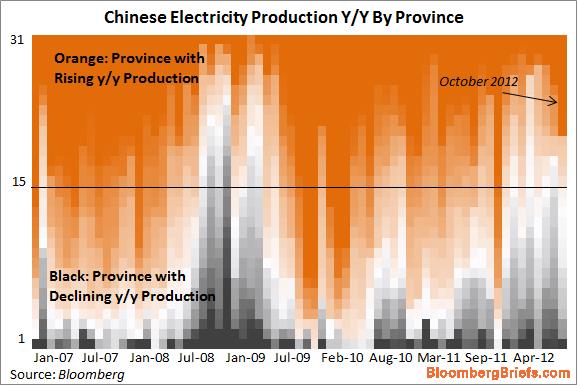
We take a look of some of the more interesting charts in the various assets, indicies, and commodities we cover.
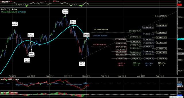
Apple
Probably the most talked about death cross in ages.  Apple’s 50-day moved through its 200-day moving average last week leaving the stock technically vulnerable.   This sell-off probably ends in a massive short squeeze sparked by some positive fundamental news, in our opinion.

Charts_Dec9_AppleMexican Bolsa
Sneaky rally to new all-time high.  Mexico’s stock market has been the tortoise of Aesop’s Fables.  Slow, steady grind higher.

Chart_Dec9_MexBolsa

Brazil Bovespa
Mexico’s Bolsa must make Brazil’s Bovespa the hare of Aesop’s Fables.   The index has been weighed down by the China slowdown and the government’s use of some of large cap stocks, such as Petrobras,  as piggy banks.

Charts_Dec9_BovespaIndia’s Sensex
The index has been one of the best performers in local currency terms this year.  It is also closing in on an all-time high.

Charts_Dec9_SENSEXHang Seng
It’s no wonder that equity markets are rallying into the close for the year.  The Hang Seng is our favorite indicator species of global risk appetite.  The index has performed remarkably well given the Shanghai Composite if just off a 3-year low.

Charts_Dec9_HANGShanghai Composite
The Shanghai bounced hard after making a 3-year low on Tuesday.   This index is the odd man out this year the only major stock market index we cover with a negative return.  It could be setting up as the trade of 2013, but still needs more technical work, such as taking out the 200-day moving average.

Charts_Dec9_ShanghaiJapan’s Nikkei
The Nikkei has had a huge snapper rally based on the expectations Shinzo Abe will become Japan’s prime minister next Sunday and will lean heavily on the Bank of Japan to implement massive quantitative easing.  The yen has weakened considerably and taken the Nikkei up.  This policy will not be without big risks, however.

Charts_Dec9_NikkeiAustralia’s All Ords
Not far from a 52-week high.  Australian equities are caught in between the risk on rally and weaker commodity markets, in our opinion.

Charts_Dec9_ASX

U.K.’s FTSE
It will be interesting to see if the FTSE can break to new highs by the end of year on the back of the DAX and CAC breakouts.    We think traders, led by Santa Claus, will have the Christmas Spirit in them to move the index over 6000 by the New Year.

Chart_Dec9_FTSE

Euro
The euro has been in a definitive range over the past three months.  Having difficulty breaking above 1.31625.   Let’s see if Italy’s political problems and economic weakness can take out the downside at 1.2700

Charts_Dec9_EuroYen
If they don’t sell the Abe news next week, the yen looks ready to break to new lows.   Feels like traders are setting up the Japan trade next year.  Long the Nikkei, short the yen.   Two death crosses this year! Outch!

Charts_Dec9_YenCrude Oil
Crude oil has led the commodity complex lower.  Resistance levels are declining though crude is trying to hold its recent low of $84.52.  It should be helped by the China story, but the CFTC is working hard to take the spec bid out of the market.  Lower crude has now become equity positive.  Wouldn’t be surprised to see the low at 79ish tested.  Brent may be a different story, however.

Charts_Dec9_Crude OilCopper
Clearly bouncing with the Shanghai.   Tough one here.

Charts_Dec9_CopperShanghaiGold
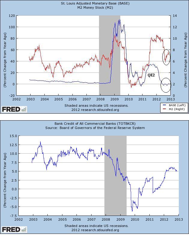
Gold has been a very difficult trade this year.  If QE∞ can’t move the yellow metal to new highs, something must be wrong.   Though the actual printing of money has lagged greatly QE rhetoric.  The last time we looked the U.S. monetary base is slowly shrinking and the ECB has yet to engage in OMTs.   Maybe the rise of Shizno Abe as Japan’s Prime Minister next Sunday will be the spark.   And, maybe, not.   We have learned the hard way never to fall in love with a position.

Charts_Dec9_GoldWheat
Cool chart.  Big spike and big, long flag formation.  A breakout to the upside would not be positive for the overall economy and global political stability.

Charts_Dec9_Wheat(click here if charts are not observable)

Posted in Apple, Charts, Technical Analysis | Tagged , , , , , , , , , , , , , , | 6 Comments

Global Trend Indicators

WIR_Global TrendWIR_Equity_MA(click here if tables are not observable)

Posted in Global Trend Indicators | Tagged , , , , , , , | 1 Comment