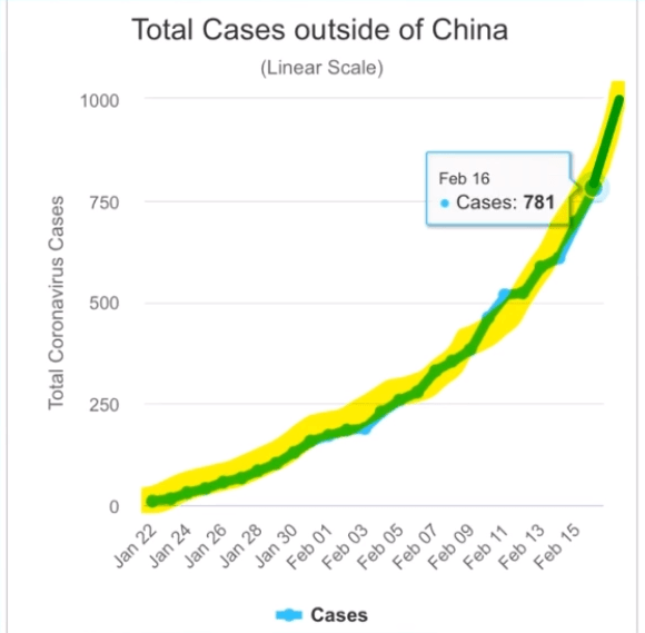
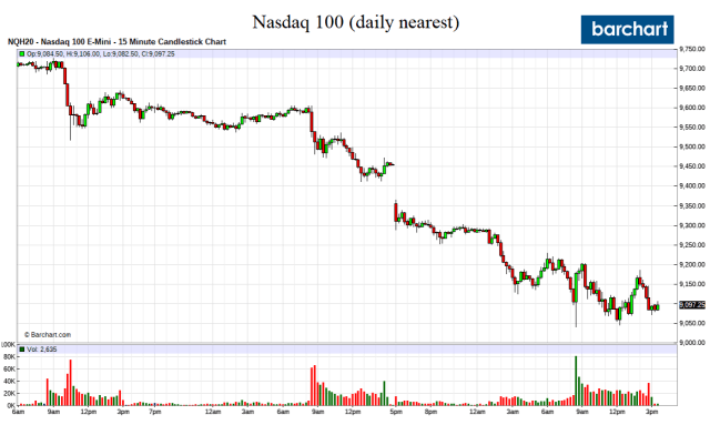
Wow, the Economist had almost perfect timing.
After publishing the following cover on Thursday, the Nasdaq 100 is down 7 percent in two days.

Regression To The Mean
So, is there anything to the Magazine Cover Jinx? We wrote and are reposting our thoughts from a few years ago. It goes something like this:
- The superstar or outperformance of the subject attracts attention and intense public focus and eventually a magazine cover
- The outperformance does and can not last forever, often peaking as the magazine cover goes to press
- The subject’s performance eventually regresses to its average performance
- Ergo the conspiracy of the Magazine Cover Jinx
Simple. QED
Why do stocks and assets markets crash?
Why is there is a Sports Illustrated jinx and magazine cover stories often signal a sign of a top or bottom of the subject being portrayed?
Regression to the mean, or, more simply, just moving back to the long-run averages.
Dodgers Tank After SI Cover Story
After going on a tear of 51-9, the best 60 game winning stretch in 105 years, the ink was barely dry on the August 28th Sports Illustrated’s cover, which read, “Best Team Ever,” before the Dodgers went into a major tailspin.

.
“Best. Team. Ever?” The ink was barely dry the cover of our Aug. 28 issue—which hit newsstands Aug. 23, with a corresponding comparison to the greatest teams in history online—when the Dodgers fell into a tailspin that they have yet to escape. Through Aug. 25, they had gone 91-36 for a .717 winning percentage, which put them on a 116-win pace, good enough to tie the 2001 Mariners for the highest total of the 162-game expansion era. Since then, they’ve lost 10 of 11 to the Brewers, Diamondbacks and Padres, and while they still have an ample cushion to win the NL West and wrap up homefield advantage in the National League playoffs, they’ve shown that even if the infamous Sports Illustrated cover jinx is a myth, this squad is hardly invincible. – Sports Ilustrated, September 6
Sports Illustrated Cover Jinx A Myth?
We disagree.
Teams, players, politicians, companies, markets or, whatever or whoever, always seem to be cover stories either at at their peak or nadir. For sure, the Dodgers 51-9 winning stretch was unsustainable, and the law of averages had to kick in.
Black Swans Are Rare
We do admit there are on rare occasions when Black Swans come along that defy all probabilities and shatter age old records. Rarely.
The 2015-16 Golden State Warriors were one, but couldn’t validate their 73-9 record shattering season, reverting to the mean after executing the biggest choke in NBA championship history. Blowing a 3-1 lead to the Cleveland Cavaliers.
In other words, the Warriors lost three games in a row in the NBA finals, 33 percent of what they lost over the 82 game season. That was one “mean” reversion to the mean!
No more, however.
“The Warriors are going to win forever, if everything stays the same. This season is over. You know, we’re gonna play it out, and the Warriors are gonna win. And then the next year it’s gonna be the same thing.” – Jeff Van Gundy, September 6
Regression To The Mean
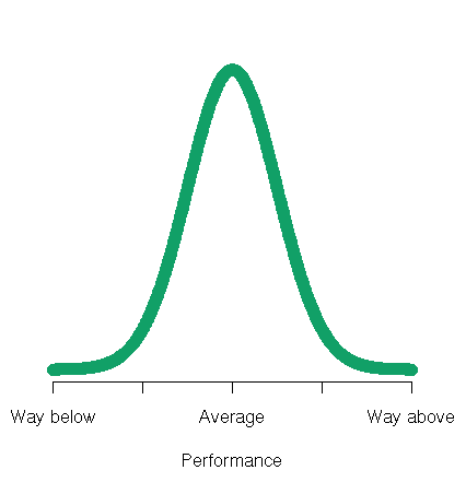
What about the [Sports Illustrated] curse? What happens is that some athlete somewhere in some sport will perform way above average. Sports Illustrated has to have something on its cover and so seeks out those athletes who are doing exceptionally well, and picks from among them the one that outperforms them all. In other words, this particular athlete will have performed way, way above average, a rare event. At this point, their picture is shown.
But, lo! In the coming weeks, our poor athlete slumps back to average or even below, disappointing all, and once again proving the validity of the curse.
All that has happened, however, is that the athlete has “regressed to his mean.” The overwhelming probability is for that athlete to perform near his average, which the athlete subsequently does. It’s no slump after all, just a return to regularity.
To say the SI has a “cover curse”, then, is no different than saying a coin has been hypnotized after a “Tail” finally shows up after a successful run of 20 “Heads” in a series of coin flips. – William M. Briggs
What Does The Sports Illustrated Jinx Have To Do With Asset Markets?
First, markets are not immune to the magazine cover curse. We can recall many covers that were contrarian calls of market tops or bottoms.
Probably the most famous was BusinesWeek’s August 1979, The Death of Equities, cover.
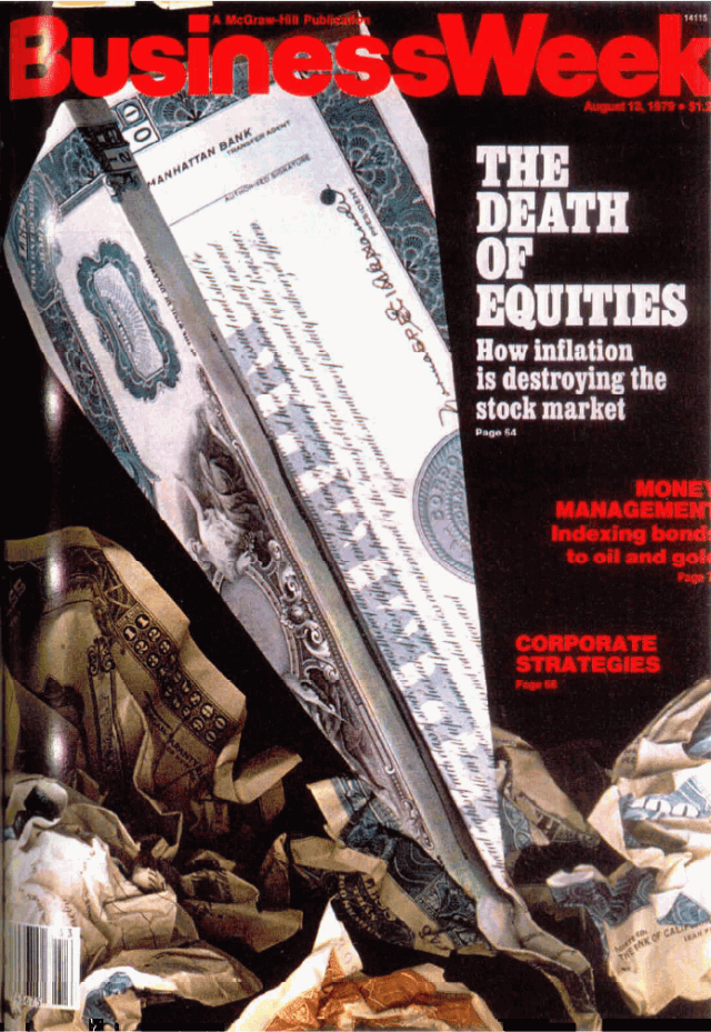
The stock market had been in a decade long bearish funk. The cover didn’t mark the end of the bear market as it banged around another seven months with the S&P500 falling another 8.6 percent bottoming in March 1980. The market didn’t break out into the multi-decade bull run a few years later in August 1982. Timing is tricky but close enough for government work.
The stock market had performed way below its long-term average performance, everyone was bearish on equities and had sold out, including BusinessWeek. Ergo, regression to the mean with some overshooting.
Yes, markets almost always overshoot, not only to the downside but also to the upside.
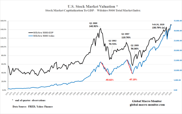
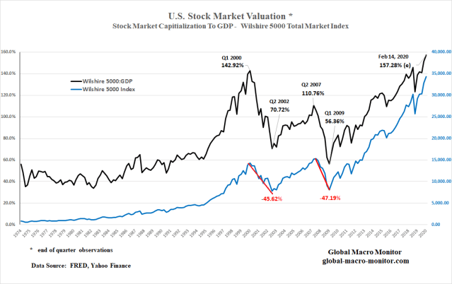
Current Asset Markets
That brings us to today’s asset markets and U.S. household net worth.
We came across a chart, similar to the one below, which piqued our curiosity and motivated us to crunch the data and come up with our own observations and conclusions.
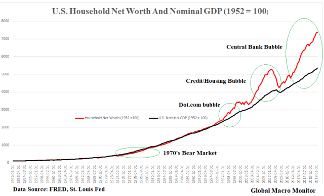
The Data
The chart is self-evident. We are in another asset bubble.
This one, however, is more complicated.
More of a steel bubble, if you will.
Harder to burst and long lasting as it is created and driven by central bank money. Credit based money bubbles pop easier and more quickly as they are vulnerable to a lightning fast deleveraging as was the case in the last crisis.
Asset prices, as reflected in household net worth, are once again divorced from economic reality now more than ever before. In our above analysis, the difference between the time series of household net worth and nominal GDP.
The two series tracked each other very closely for 45 years up until 1997. Asset prices grow with fundamentals, which, ultimately, are driven by economic growth.
U.S. household net worth is currently 38 percent or more than three standard deviations above the nominal GDP index, where the average difference is only 6 percent for the 65-year sample period.
Greenspan Put
The difference data (net worth less GDP) appears to have become non-stationary – e.g., an unstable mean, etc. — after 1997.
Let’s also not forget the flaws of assuming a normal distribution in asset markets, which have “fat tails” and skewed distributions, which is evident with this data, post 1997.
It may be the result of many things, including the rise of the internet and moral hazard.
The result of the cumulative effects of 1987 stock market bailout, the 1995 Mexican Peso bailout, and the 1997 Asian Financial Crisis, where western policymakers immunized investors from taking long-term losses. Thus, 1997 may have been the year markets finally realized and recognized the “Greenspan Put” was alive and for real.
Deleveraging
Granted there has been some deleveraging by households since the great recession, mainly in mortgage debt, so some of the increase in net worth could be the result of slower growth in liabilities. In additon, some may be due slower nominal GDP growth.
More analysis is needed to confirm these alternative hypotheses but you don’t pay us enough for us to put in the extra effort.
We did construct a nice table for you, however, and our conclusion of the above alternative explanations? De minimus.
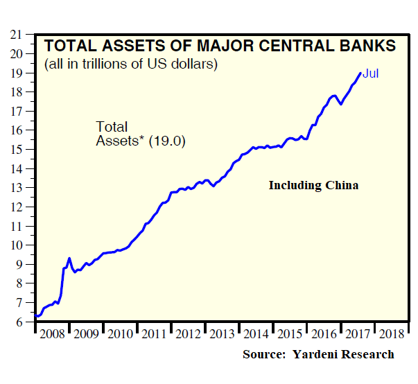
It’s all asset inflation the result of the expansion of global central bank balance sheets.

Pension Entitlements
One of the results that really surprised us most in our analysis was the rapid rise in pension entitlements as a proportion of household wealth.
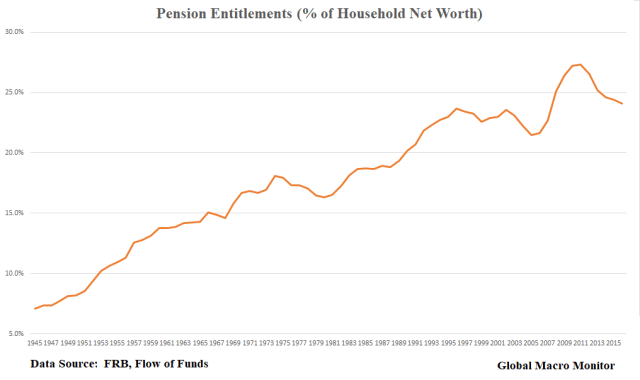
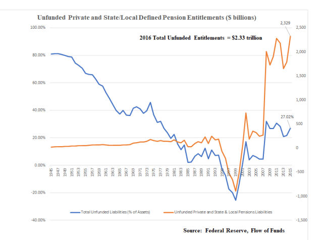
We don’t view this as positive as about 30 percent of pensions, on average, are currently underfunded. Either contributions are going to be dramatically increased or pensions will be restructured and future payouts reduced.
Either case will be bad for demand and the economy.
The alternative is to cut current services, which is also already taking place. Again, it will only add to the “clash of generations” and more political conflict.
We eventually believe the pension shortfalls will become so large the federal government will be forced to nationalize and monetize them leading to inflation. We have a lot of experience in countries that have resorted to such policies.
Unfunded pensions are nothing more than “fake wealth.”
Conclusion
Several times a week I walk with a good friend who could have played center field for the Cleveland Indians. But he had a higher calling. Let’s call him Joltin’ Joe (JJ).
We have been friends for years and have seen many asset cycles.
We live in a lovely county in Northern California, which is in the midst of another raging housing bubble. The median income for the county is around $61,000, up about 16 percent from the year 2000. The median house price is $639,000, which has more than doubled from $319,000 in March 2012.
Fundamentals dictate that the median price should be, more or less three and half times the median income, or around $215,000. Let’s add another $50K for the California sunshine premium, though it was 111 degrees here on Saturday!
At an expected or fundamental value of $265,000, that puts the current median home price in our county 140 percent overvalued.
In general, housing prices should move with inflation and wages. Such a large change in relative prices is a massive transfer of wealth from the young to the older generations, who own most of the housing stock.
That is if the young are gullible enough to pay these prices. Again, more potential conflict leading to the clash of generations.
JJ’s Observations
JJ likes to talk about the housing market. He is very astute noting that this housing bubble is different than the last one just ten years ago. There isn’t the leverage that there was in 2007.
A lack of supply drives this housing bubble
Hedge funds, private equity firms, and other investors swooped in during the crash and bought up many of the modest homes in foreclosure. They then foreclosed on the buyers and are now raising rents on their newly owned homes.
People, such as “The Foreclosure King” (and you know who I am talking about), who would be living under a bridge or freeway if they were not bailed out by the U.S. taxpayer and the Fed during the financial crisis, somehow think they deserve and are entitled to their dubiious created wealth. Now they are gouging the younger renters, some of who they probably foreclosed on, who are now priced out of the market and can’t afford to buy a home. These people are the new “welfare queens.”
Wonder why the body politic is so angry?
Economic anxiety will only lead to greater political instability.
A Mean Regression To The Mean
JJ is not an economist. I tell him to be patient unless he wants to day trade and try and flip houses, which can be very profitable if your timing is right and you get out before the bubble pops.
There are few people who do, however. Greed usually overpowers common sense when you’re making that kind of easy money.
Assets, whether it be stocks, bonds, emerging market debt, or houses will eventually regress to their mean or fundamental value. They inevitably always overshoot, creating incredible buying opportunities.
Just as the Los Angeles Dodgers are now doing, regressing to the mean and overshooting their true potential, while in the midst of their own Sports Illustrated jinx.
Diiferent Type Of Asset Bubble
This asset bubble is different.
It is larger, encompasses almost all asset classes, may inflate much further, will likely last longer than many expect, and will be harder to burst because the global central banks have taken $13-15 trillion in assets out of the markets, creating artificial asset supply shortages, and repressed interest rates to zero or below. Leaving few alternatives but to chase risk assets.
Enjoy riding the bubble. It is fun making money in bubbles and you can become very rich if you time it and get out it time.
It is getting late, however, and there are an increasing number of events looming on the horizon that can knock the markets for a loop.
Also be careful on the short side. Wait for the markets to break.
When the bubble does burst, and it may take some time, it will be one helluva “mean” regression to the mean.
Or it could crash next month. Timing is tricky.
We are waiting for the S&P500 to make the cover of Sports Illustrated. We may waiting a long time, however, as very few believe these asset markets are driven by real lasting organic fundamentals.
Good luck, comrades.