Why Did Stocks Fall After Rate Cut?

Gravity.  Stock prices are waaay too high.

Stocks went down not because the Fed messed up.  If they needed to cut 50 bps and signal more to come because of coming economic weakness, what in heavens name were stocks doing at record highs and extreme valuations?   Nobody knows the future.

Expecting the Fed to see all, know all and precisely fine-tune the economy and markets is tantamount to having someone thread a needle with boxing gloves on and blindfolded during a rollercoaster ride.   The belief that they can have distorted markets beyond all repair.

S&P

Seriously, folks, the lack of price discovery in all things financial is a big problem.

Valuations

Check out the following macro valuation charts at historical extremes.

Earnings are slowing, we believe the economy is at secular peak margins and the international economic order is in tatters.  The S&P is shattered!

Rally on, Garth, if you want to.  Not with our long-term book, however.

The pressure on the Fed from the market socialists (see our last post) will intensify.

Moreover, given the New Economy’s feedback between asset prices, Jay Powell will soon be talking about QE if stocks are headed where we think they are.

Call it an unstable equilibrium, a stable disequilibrium, or an unstable disequibrium.  You decide.

Valuations_4

Valuations_3

Posted in Equities, Politics, Uncategorized | Tagged , , | 3 Comments

Fed To Cut With “Loose As A Goose” Financial Conditions

It is absolutely clear to us this rate cut is motivated to placate a clueless and unprincipled president and also including Wall Street traders.  We call them the “market socialists” who look for government intervention to set prices rather than allowing the market to work its invisible hand.

Housing And Shelter Now Unaffordable For Many, Especially The Young

If you are dumbfounded why young families are priced out of the housing market and it takes a $70k annual salary to rent a 2-BR apartment in California,  your understanding will begin with today’s interest rate cut.

Only in 22 counties in the United States is a one-bedroom home affordable to someone working 40 hours per week at federal minimum wage.  —  CityLab

We suspect the Fed’s cave to the White House and the market whining for easier financial conditions will only complicate the above problems.

We Are Data-Driven

If economic and financial conditions were tighter we would be less harsh but they are not.

The Chicago Fed’s National Financial Conditions Index (NFCI) shows financial conditions are over 20 percent easier than when the Fed tightened in December.   Yes, their pivot eased without acting but come on, man!

Let markets clear, let prices mean something!

We suspect, even if the Fed cuts today, conditions are going to tighten, in part, because of the cut.  Stranger things, no?

Trading 

This the hand traders and investors are dealt, however.   Trade accordingly.

We believe it is time to spank the strength as the S&P moves into our selling zone.


           Chicago Fed’s National Financial Conditions Index (NFCI)

Financial Conditions Index

Posted in Uncategorized | 1 Comment

Why Is Apple Rallying?

For iPhone, we generated $26 billion in revenue. While this is down 12% from last year’s June quarter, it is a significant improvement to the 17% year-over-year decline in Q2. – Tim Cook, Earnings Conference Call, July 30

This is why Apple stopped reporting iPhone sales and breaking out revenue by components.  Does the market really believe Apple is now “Beyond Meat iPhones?”

If he can convince the market of this and maintain Apple’s close to $1 trillion market cap, Tim Cook is the Master Chef of earnings presentations.  One Helluva Cook!

Posted in Uncategorized | Leave a comment

Deflation? Not Even Close

Core CPI consistently prints around 2 percent, the average over the past eight years, with the latest reading of the June core rate coming in at 2.1 percent.  Sure, we can find another index to show lower or higher rates of inflation.  Your choice for your confirmation bias.

We maintain the Fed has achieved their targets of 2 percent inflation and full employment.   Many on Wall Street and in the White House do not believe the Fed has hit the Dow and S&P500 targets, however, thus we will get a rate cut next week.

Go ahead, call us cynical.

CPI_CORE

Housing And Shelter In Basket

We’re not big fans on how the government measures inflation, in the first place,  as the largest portion of any consumer basket is housing (42 percent in CPI basket), which includes shelter (33 percent), and just doesn’t pass the smell test in terms of a true metric of price changes or even a cost of living measurement.

Because the majority of families own their homes, the government uses a proxy called owners equivalent rent (OER)  to measure housing inflation,  which is 24 percent of the CPI basket.   The BLS changed how housing was measured in the CPI basket after the big inflation of the late 1970s, in an attempt to separate housing as an investment versus the shelter services it provides.

We haven’t formally tracked it but our priors are OER doesn’t come close to the changes in the monthly mortgage payments of average urban consumers.  Furthermore, the BLS makes hedonic adjustments to rents (7 percent of the basket).

With each passing year, the dwellings in the CPI housing sample deteriorate, losing some value (depreciate), and deliver less shelter service to their occupants. If this were not taken into account, the CPI would have a downward bias. To offset this quality loss, the aging bias due to depreciation, staff at BLS developed an age-bias adjustment.  This tool, which BLS began using with the CPI for January 1988, makes a monthly incremental adjustment to each housing unit in the sample to maintain a constant quality index over time.

The theoretical basis for the hedonic method used in estimating age bias is found in Randolph (1988). Randolph estimated that the age bias due
to depreciation was 0.3 to 0.4 percent annually.  — BLS

Whether it’s an upward or downward adjustment, the fact is none of the shelter prices are real prices paid, which seems absurd to us.

Younger Generations Priced Out Of Housing 

Moreover, the reflation of the housing bubble coupled with the rapid increase in student debt has priced much of the younger generation out of the housing market.

For generations, the wealth of U.S. households was built on the foundation of homeownership. That is changing.

Homeownership rates for younger Americans have fallen sharply over the last decade. The median age of a home buyer is 46, the oldest since the National Association of Realtors began keeping records in 1981. Economists, policy makers and mortgage lenders expect the trend to extend to younger generations. The decline illustrates what for many Americans is the real legacy of the financial crisis.  – WSJ

That 7 percent weight for rents in the CPI basket is going to have to be increased.  See here how weights in the basket have changed over the years.

$70k Annual Salary Required To Afford 2-BR Apartment In California

Take a look at the map below and then ask yourself, “are the official inflation statistics capturing the real cost of living and price changes?”  We believe the answer is so freaking obvious.

For most Americans, access to decent, affordable rental housing remains cruelly beyond reach. Only in 22 counties in the United States is a one-bedroom home affordable to someone working 40 hours per weekat federal minimum wage.  —  CityLab


Rents_Wages.png


See here why some argue that the CPI actually “overstates” inflation and why the Fed’s preferred measure of inflation is the PCE deflator. We disagree, as we are more interested in measuring true inflation not a hypothetical cost of living index,  but provide the argument and let you decide.

inflation – a persistent, substantial rise in the general level of prices related to the volume of money and resulting in the loss of value of currency – dictionary.com


Posted in Inflation/Deflation, Uncategorized | Tagged , | 4 Comments

Why The Tour de France Is So Brutal – Vox

Posted in Uncategorized | Leave a comment

Good v. Evil

Yes, that is what 2020 is shaping up to be all about.

Watch the videos and read the tweets below and you decide, then act…


Posted in Uncategorized | Leave a comment

Enter The Selling Zone 2.0

It’s that time again.

No, not the, now annual October fires in California (helluva a Chinese hoax, btw) we’re running from but the S&P moving into the selling zone.

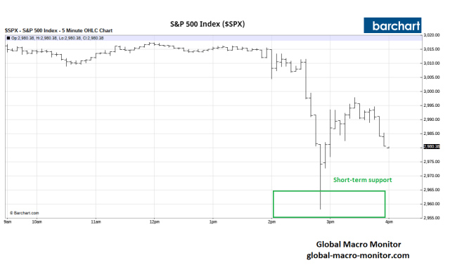
We are reposting a piece we published on the very day the market peaked in July right around here.   The S&P came close to making a new high today, within 1/2 point and end at its closing high of 3025.86.

Money was made on that trade but not the kind that we think is coming.

We maintain this is good place to sell and set up shorts again.  We will sell all day up until 3125, at which point, we will cut and capitulate that “this time may be different.”  Arghh.

Stock valuations are at record highs and the markets are so, so gummed up and distorted by government intervention, mainly the Fed — the ultimate socialism, in our book — policymakers and market analysts have lost their compass and can’t tell, north from south, east from west or front from back.  The cheerleaders are out in full force with their pom-poms this week, by the way.
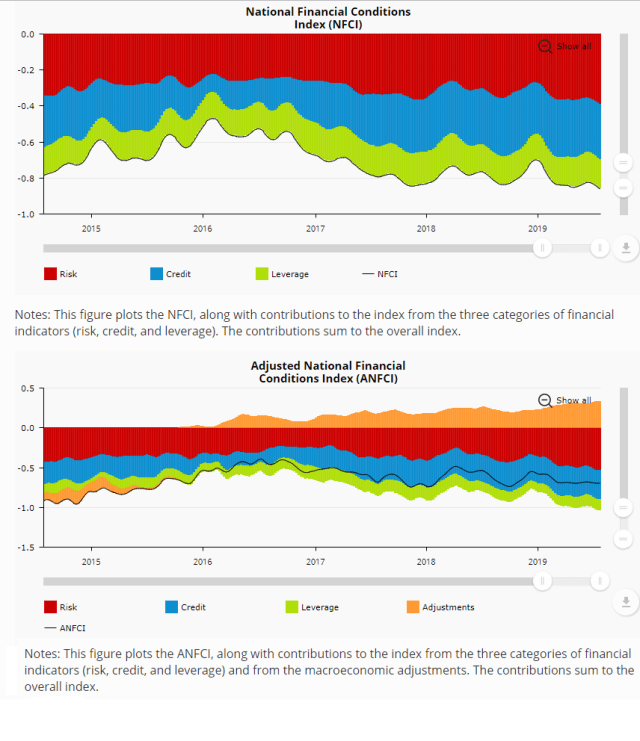
Tight Liquidity

Nobody can seem to figure out this “liquidity problem” in the repo market and why banks with excess reserves are not arbing the Fed funds and repo rate.

The shadow puppets that we see dancing on the wall of the cave are based on our first principles.

1)  Interest rate distortions.  If prices are not allowed to move to equilibrium, quantities will.  Go back are read some of our rent control analogies on how the repression of interest rates will lead to excess demand for liquidity, which can only be filled by monetization, ie., the Fed.   Witness the now.

Rent Control_2

2) Larger budget deficits and structural changes in Treasury financing.  The structural changes in the Treasury market and pro-cyclical deficits are wreaking havoc on liquidity and crowding out funding in other markets.  See here.

Deficit

Few understand that the U.S. G used to fund up to 50 percent of its annual shortfalls with the social security surplus (off-budget), limiting its financing pressure on the markets.  No mas, comrades.

Social Security is now running monthly deficits, which will continue to get worse until the geniuses fix it.   The Treasury will have to increase its reliance on the market not only to fund the on-budget deficit but now an off-budget deficit (Social Security plus USPS).


Treasury_Debt

More in the next few posts.

Finally,  check out the twisted logic of the markets.  Rick Reily is one smart dude and the real brains at Black Rock. He, in essence, states, last year interest rates were too high now they are too low but the market needs the liquidity from the Fed.   Do you have a feeling everyone is winging it?

In a well-functioning economy, interest rates would rise, reducing the demand for funding from zombie companies and/or drive them out business, for example, and savings would increase.   But interest rates can’t rise because it’s not a well-functioning economy.  There is too much debt, too many distortions, and the economy is too dependent on asset bubbles.

Enter The Selling Zone


We have entered the selling zone — S&P 3025-3100 — to execute the Get Shorty trade.  This also provides an excellent opportunity for long-term investors to start cutting back on risk if they have not already been doing so.

You know our view.  Rarely should LT investors reduce risk in a significant manner, maybe just three to four times during their working lives, but this is one of those times, we believe.

Structural Headwinds 

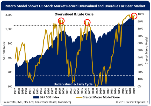
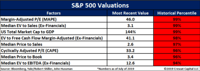
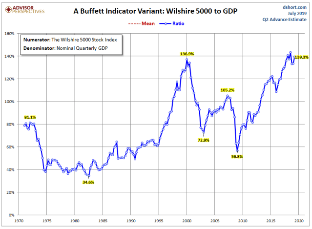
The tectonic plates of the global international economic order are breaking apart and moving in the wrong direction and valuations are at historic extremes.

Not to mention the absurdity that “billions upon billions” of fixed-income securities seem to enter the negative interest rate Twilight Zone on a daily basis.

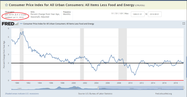
Moreover, the Fed is about to take the unprecedented action of cutting rates next week with stocks at historical highs and inflation marching higher.   That signals, at least to us, a Fed gone political and that policymakers have created a beast they cannot tame.

We expect the summer Friday afternoon ramp into the close, which will be an opportunity to start letting some go or setting some up.  It’s hard to sell strength but much more enjoyable than selling into weakness and into a big hole.

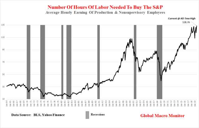
Stocks Out Of Runway

The charts below illustrate that history dictates that stocks have very little room to run to the upside from current levels.    We could be wrong and ‘this time may be different.”

We seriously doubt it, however, but discipline always trumps conviction and that is why we have a hard stop at 3125 to cover.  We will then wait to put them out at even more absurd valuations.

Long-term investors that do sell should have a Plan B to get reinvested if they are wrong.

Good luck, folks.   See ya’ thirty-plus percent lower.
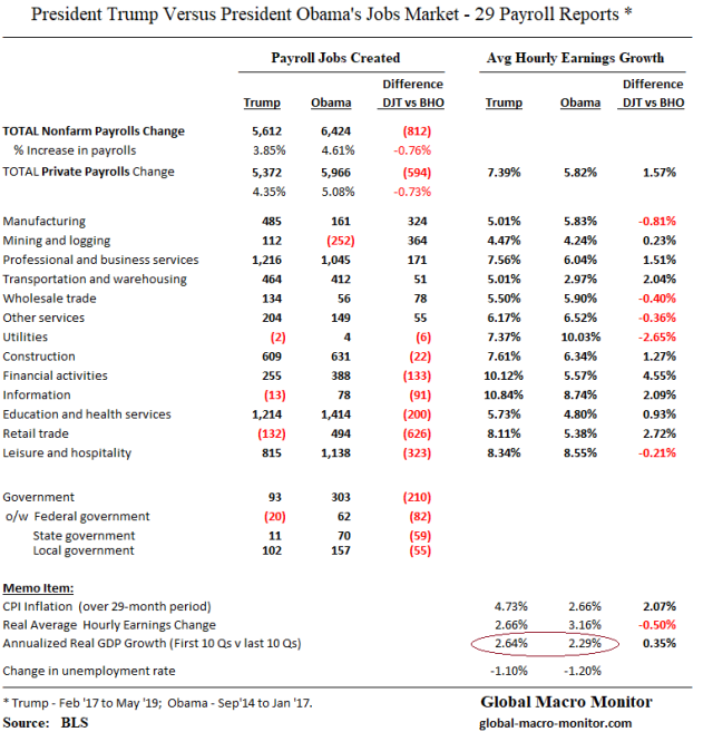
Micro Metrics

Valuations_1

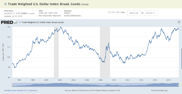
Hat Tip: Antonio Pérez Algás  @apanalis

Valuations_2.png

Hat Tip:  Kevin C. Smith, CFA  @crescatkevin
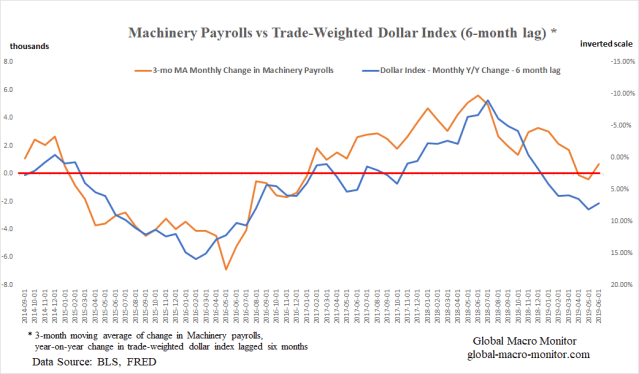
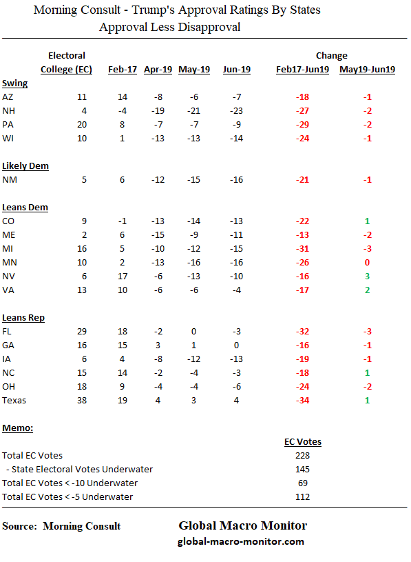
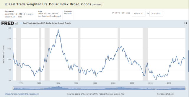
Macro Metrics

Valuations_3

Valuations_4

See disclaimer

Posted in Equity, Uncategorized | 16 Comments

Life After 10 Downing Street

This is too funny!  Click on and enjoy.

Posted in Uncategorized | Leave a comment

WWLT: What Would Lincoln Tweet?

Lincoln

Maybe

Posted in Quotes, Uncategorized | Tagged , | Leave a comment

Why Trump Continues To Beat The Fed With An Ugly Stick

It’s the economy dollar, stupid.   And its impact on manufacturing payroll jobs.

Trump’s Economic Scorecard

Trump’s economic comps versus the prior 29-month period before taking office just aren’t that impressive even as he touts “it’s the greatest economy ever.”  Tomorrow we get the first look at the Q2 GDP print.  The Atlanta Fed’s  is forecasting a compounded annualized increase of 1.3 percent, down from 3.1 percent in Q1.

Jobs 


Man_Edit_1

The data above illustrate employment created under President Trump lags significantly the prior 29-month period, by almost one million payroll jobs, or -812k, including private payrolls of -594k.  Nominal wages are higher but the purchasing power is negated as inflation has almost doubled.

Yes, we get it the supply of workers is shrinking.

Mining and Manufacturing Payrolls:  Oil Prices & Dollar Correlation

Where the job comps (emphasis on comps) favor the Trump administration most are in mining and manufacturing, which can, in large part, be explained by  1)  the recovery in oil prices in the case of mining, where the majority of the recovery took place in support activities for oil and gas operations, after the 75 percent crash in WTI from July 2014 to February 2016,  and 2) the 20 plus percent strengthening of the dollar in the 29 months leading up to the birth of the Trump administration, which torched the manufacturing sector, particularly in metals and machinery.

We go deeper on manufacturing payrolls and the dollar in this post and leave mining and oil prices for later.

Durable Manufacturing 

Man_Edit_2

The table shows that durable manufacturing payrolls under Trump have outpaced the prior 29 months by 367k jobs,  primarily the result of the recovery of job losses that took place in the metals and machinery sectors, which, we believe were adversely affected by the spiking dollar.  Contrary to popular wisdom, the payroll increase in auto manufacturing is lower under President Trump than the prior period.

Dollar Correlation 

Take a look at these correlations between the 3-month moving average of monthly manufacturing payroll changes and the year-on-year change in the trade-weighted dollar with various lags.   We wrote in an earlier post it makes sense to look at lags,

Theoretically, it also makes sense as manufacturers do not change their hiring decisions based on short-term moves in demand, relative price changes, or competitiveness.   A sustained move in the dollar for, say, over a one year period  may incentivize management to change production and hiring decisions, which then takes months to ramp up.  – GMM, July 8th


Man_4

Those are stunning correlations, folks, which measure how jobs and the dollar move together.   A perfect correlation would be -1.0 or 1.0.

A negative correlation between the change in manufacturing jobs and dollar moves makes perfect economic sense and explains why Trump wants a weaker dollar, which creates a more competitive manufacturing sector ergo more jobs in the rust belt.


Man_3

We can’t stop staring at the above chart, which illustrates the -0.88 correlation between the 3-month moving average of the monthly change in the machinery sector payrolls and the year-on-year monthly change in the trade-weighted dollar index, lagged six months.

Politics

The following table is the latest tracking poll data from Morning Consult on the President’s approval ratings in the states that matter most in 2020.   He is now underwater in every state but Texas and even in Georgia.

Now, do you understand why Trump takes an ugly stick to Chairman Powell on an almost daily basis?

Man_Monring Consult_Polls

The Trump administration’s economic and political advisers may not have formally run the correlations and connected the dots but they are sure acting as if they have.


Prepare for a currency war.


Appendix

Man_5_$


Man_6_$

Posted in Uncategorized | 1 Comment