Completely FUBAR…
https://twitter.com/vixcontango/status/1231956336331587584?s=21
Of course, if Larry M.’s Lehman-like drawdown scenario is realized, haven flows and shorts will pile into long-notes and bonds as a proxy short but we have no interest in trading fixed-income securities with a 100 bps negative real yield.
Instead, we wait patiently on the beach counting cash and listening to Johnny.
It’s just one of those rare times in an investor’s life where,

But most won’t. Greed is a powerful thrust.
Its February release suggests that 66 per cent of respondents expect equity prices to keep rising this year, well above the 56 per cent reading recorded in early 2019, or 51 per cent in early 2016, ahead of the last election. Indeed, the current level of bullishness tops even the optimism seen in early 2007.This sounds like good news. But there is a catch: each of the last four times that optimism levels have exceeded 60 per cent, equity prices have fallen soon after, with the decline ranging from 10 per cent in 2018 to 47 per cent in 2008. “Our indicators tell us, we’re very close to a Lehman-like drawdown,” argues Larry McDonald, a former strategist at Société Générale who now runs The Bear Traps report newsletter, referring to the share price fall that followed the collapse of Lehman Brothers in 2008. –FT
COTD = Chart of the Day
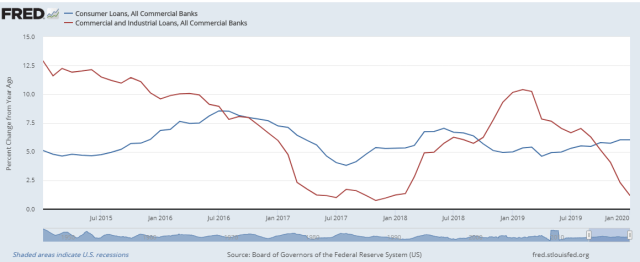
Big divergence in bank lending to consumers and businesses. Consumer lending y/y growth fairly steady but hard to tell what is causing the steep fall-off in the growth of lending to the corporate sector. C&I loans have traditionally financed inventory builds but how much inventory do Facebook, Mr. Softie, and Google hold?
This could go either way. We shall soon find out, however.
Chris Martenson. Ph.D. from Duke in Toxicology is very good on this topic and one of the first out with a correct analysis of the coronavirus. We posted his first video when there were only a few thousand cases reported.
Take the 25 minutes to get more informed.
“Japan is going to the place where it is going to blow up next.”
Exponential Growth
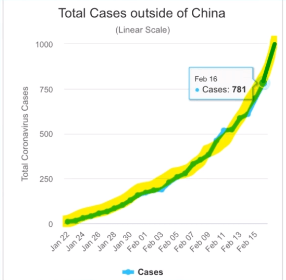
Wow!
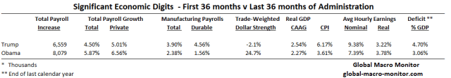
President Trump likes to repeat the fictitious notion he inherited an economic mess but his hair is on fire over Obama’s factually based tweet this morning.
Here Are The Facts
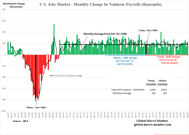
Just The Facts Ma’am

GDP growth in Trump’s first three years has averaged only 26 basis points more than Obama’s last three years albeit with a budget deficit-to-GDP running over 50 percent higher than Obama’s deficit in his last calendar year. A very expensive slight marginal increase in growth. Inflation has almost doubled.
Under Trump, jobs have increased by 6.6 million versus 8.1 million in Obama’s last three years. The average nominal wage is higher but the average real wage is lower.
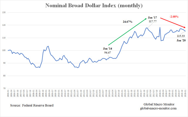
Also, note the 25 percent increase in the trade-weighted dollar in Obama’s last three years and not a peep about the Fed from his administration. Though still at a relatively high level, the trade-weighted dollar declined by almost 2.1 percent from January 2017 to January 2020.
…a stronger/weaker currency has a tightening/easing effect on economic conditions. – Economist
A strengthening dollar is also highly inversely correlated with manufacturing jobs.

Yet, this….
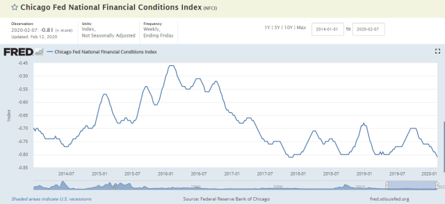
Finally, the Chicago Fed’s National Financial Conditions Index illustrates the Trump economy is experiencing some of the loosest financial conditions since the early 1990s.
Now, who is conning who, folks?
If you’re in the con game and you don’t know who the mark is … you’re the mark. — David Mamet
I’ve seen fire and I’ve seen rain. I’ve seen manias the public thought would never end. Until they do.
This ain’t our first rodeo. We have seen these types of asset bubbles many times during our career, especially when you include our emerging markets daze. We have learned two certainties:
The young Python Algo ‘bots driving stocks do not have this kind of context or history.
Supply Driven Bubbles
The current bubbles are slightly different in nature as we perceive them driven by the new supply-side economics, where both public and corporate policies have induced asset shortages of risk-free bonds, stocks, and affordable housing. They are more steely, more difficult to pop, and last longing than most think they can. Until they don’t.
Trading Versus Investing
We do recognize trading is different from investing. Good traders can flip cotton or cotton candy for a profit but even that is getting increasingly difficult with the rise of the ‘bots in this modern-day aglo driven market. We traded “billions and billions” of Apple stock each year during the company’s high growth days back in the day. And that was just Apple. No more.
Buy Low, Sell High
Though we have taken stabs at shorting this mania, we have learned some expensive lessons over the years about “Milton” Keynes‘ (no, not the town in Buckinghamshire, England) dictum,

A lesson now being learned by the TSLA shorts, by the way.
Chart Numero Uno
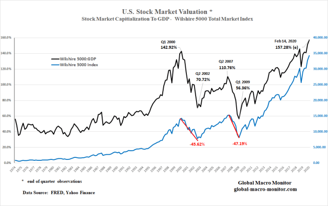
We have posted this chart — one of Warren Buffet’s favorite macro valuation metrics — many times but it still holds. The black line can’t continue to climb from lower left to upper right forever as stocks eventually have to track the underlying fundamentals of the economy. Whereas the natural trajectory for a stock index such as the Wilshire 5000 (blue line) is lower left to the upper right on the chart. The higher the black line moves above past highs, the harder and more painful the fall, or a meaner regression to the mean.
Write that down, folks.
The question is have stock valuations “reached a permanently high plateau” as the famous economist, Irving Fisher, stated just a few weeks before Black Thursday 1929?
Believe it, if you wish. After all, we now live in a culture and political environment where,
To that, we say hogwash.
We don’t know the exact point where the market tops but we will see you on the beach until it does.
Chart Numéro Deux
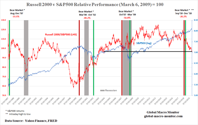
We have also put together the above chart illustrating the relative performance of the small caps, the Russell 2000 index versus the S&P500 (red line). Notice before every bear market and recession the small caps begin to significantly underperform the S&P500. Kinda like the current environment.
Does the chart then reflect an imminent recession and bear market? We don’t know but it is another warning sign flashing caution.
Best Economy Ever?
Is it possible the above charts reflect a market in the midst of the best economy ever?
We don’t think so.
In fact, the economic performance of the past three years looks very similar to the prior three years, if not a bit less robust. The table below illustrates the 27 bps of higher annual real GDP growth over the past three years comes at a very steep cost — a 1.7 percent of GDP increase in the federal budget deficit. Not exactly a productive expansion of the public debt, in our opinion.
The 2014-2016 economy was also facing a massive headwind of a strengthening dollar with the trade-weighted broad index increasing by almost 25 percent in the three years.
We have analyzed the significant impact and correlation of dollar strength on manufacturing payrolls, especially in machinery.
There you have it, folks. Not if, but when.
Until then, see you on the beach.
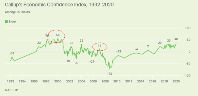
P.S. Just one more thing. The Gallup chart on Economic Confidence has traditionally been a contrarian indicator.

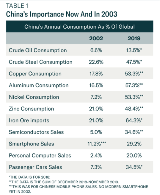
The holiday is over, but few people are back in offices and factories…the effects of covid-19 will be like those of SARS in 2003: a sharp shock to Chinese growth, followed by a strong rebound. But SARS may not be a reliable guide. China’s economy accounts for 16% of GDP today, up from just 4% then. It has become enmeshed in supply chains of mind-boggling complexity, and just-in-time production leaves little room for delays. – Economist
That Was Then, This Is Now
Hat Tip: Mike Bird @Birdyword
Run to our post, The Global Supply & Demand Shock Of The Coronavirus, which we wrote waaaaaaaay before the MSM jumped on this story.
The Global Macro Monitor has been writing about the Clash of Generations for years, and way before the headlines and data that are now starting to show up in the MSM. See here.
The fight taking place between the moderates and the progressives in the 2020 Democratic primary is just another manifestation.
The nation’s finances are almost as skewed toward the elderly as its politics are. Americans 55 and up account for less than one-third of the population, but they own two-thirds of the nation’s wealth, according to the Federal Reserve. That’s the highest level of elderly wealth concentration on record. The reason is simple: To an unprecedented degree, older Americans own the most valuable real estate and investment portfolios. They’ve captured more than 80 percent of stock-market growth since the end of the Great Recession. – Atlantic

Representative Alexandria Ocasio-Cortez is often described as a radical, but the data show that her views are close to the median for her generation. The Millennials and Generation Z—that is, Americans aged 18 to 38—are generations to whom little has been given, and of whom much is expected. Young Americans are burdened by student loans and credit-card debt. They face stagnant real wages and few opportunities to build a nest egg. Millennials’ early working lives were blighted by the financial crisis and the sluggish growth that followed. In later life, absent major changes in fiscal policy, they seem unlikely to enjoy the same kind of entitlements enjoyed by current retirees. – The Atlantic
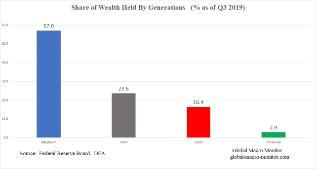
We have put together a few charts to help explain the economics between this struggle. We are grateful to the economists and statisticians at the Federal Reserve Board for constructing their Distribution of Financial Accounts (DFA), which provides a treasure trove of data.
Go To The Charts
We will let the charts speak for themselves, and, yes, we get it. Younger generations are always less wealthy than the older ones, who have had a lifetime to accumulate assets, but wealth accumulation has become increasingly prohibitive for those just starting out in our age of serial bubbles.
We are hoping the Ms will not be sucked into this massive asset bubble.

Controlling For Population Ratios

The Washington Post’s Christopher Ingraham adjusts for this, pointing out that in 1990 “boomers owned 21% of the nation’s wealth and represented 31% of the population, for a wealth-to-population ratio of 0.68 — each percentage point of the total U.S. population represented by boomers, in other words, owned 0.68 percent of the wealth.”
And yet in 2008, “Gen X–ers owned 9% of the wealth and made up 22% of the population, for a wealth-to-population ratio of 0.41.”
Millennials by comparison, are on track to have an even lower wealth-to-population ratio than that. – MarketWatch
Upshot
When you have little or no “skin in the game”, why support the system? Burn it the F&@K down!
Don’t chase and let the markets come to you Ms. The fever will break and the bubbles will burst. Not a great way to reduce the wealth gap but it will provide an opportunity to accumulate assets at a decent price.
Source: Axios
What Generation Are You
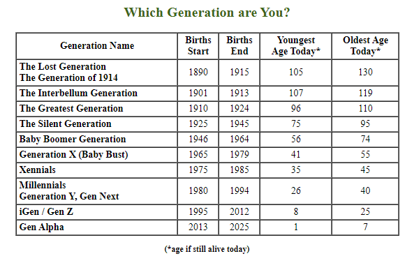
Source: Career Builder
How can it be?
See the full DW article here
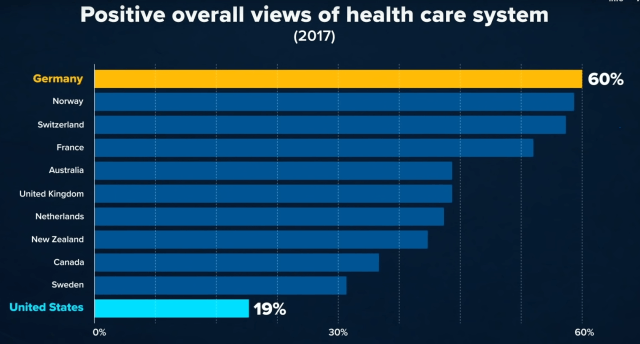
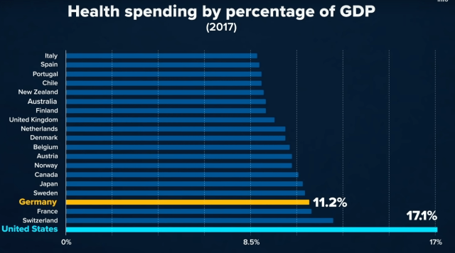
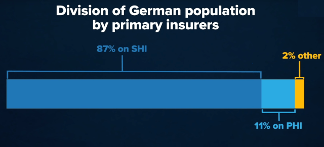
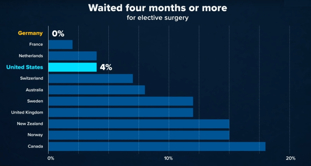
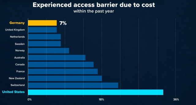
The following video on the German health care system is a must view, folks.
Take the 10 minutes and watch.
If not, study the charts.
The German system is completely private consisting of two plans: 1) SHI — Statutory Health Insurance — for those making under $60k per year, is made up of a highly regulated sector of competing not-for-profit private companies, and 2) PHI – Private Health Insurance.
Upshot
Better healthcare at a lower cost. Ich bin ein Berliner, baby!
You listening Amy, Mike, and Pete?
Hat Tip: Roro @rorotrader
Germans Much More Satisfied Than Americans
Less Than U.S. Health Care
Two-Tier System – Public and Private Options
Less Wait Times
Much Lower Prohibitive Costs
Source: All Charts Are From The CNBC Video